After a harrowing 2011, markets and investors are a little jittery. No one expects the super high correlations between stocks to persist. At some point, good old fashioned stock-picking and the rigorous research that drives it will be back in favor.
For those investors interested in rigorous research now, I offer my roadmap to the best and worst stocks and funds in the market by sector for 1Q12. The full sector roadmap report is here. The full series of my reports on the Best & Worst Sector and Style Funds is here.
The sectors with the most Attractive-or-better-rated stocks are Consumer Staples and Information Technology. Per Figure 1, these sectors get an Attractive rating while the sectors with the least Attractive-or-better-rated stocks, Financials and Telecom, get a Dangerous rating. Sector ratings are based on aggregation of my ratings for each of the stocks in the sector. This is the same methodology behind my ETF and mutual fund ratings.
Details on exactly how much of each sector is allocated to Attractive and Dangerous-rated stocks are in Figures 4 through 13.
Figure 1: Sector Rankings Based on Quality of Stocks vs Indices
 Sources: New Constructs, LLC and company filings
Some of my favorite stocks in the Technology sector are Intel [s: INTC], Google [s: GOOG] and Oracle [s: ORCL]. All of these stocks get an attractive-or-better rating as do my favorite Consumer Staples stocks: Walgreens [s: WAG], Lorillard [s: LO] and WalMart [s: WMT].
I like INTC because it is one of the safest options with compelling upside. Per my previous article, INTC’s strong ROIC, high dividend and large cash reserve underscores the strength of Intel’s business and the ability of its management team to allocate capital intelligently. Wal-Mart does not have as high an ROIC as INTC but it generates enormous economic earnings. At the same time, the stock is cheap with a current valuation (based on 1/23/12 closing price of $60.91) that implies the company’s profits will permanently decline by nearly 15%. More details in this article.
Some of my least favorite Financials and Telecom stocks are: Citigroup [s: C], American Express [s: AXP], Allstate [s: ALL], JP Morgan [s: JPM], Sprint [s: S] and Crown Castle Int’l [s: CCI]. All of these stocks have a Dangerous-or-worse rating.
Though Citigroup’s stock has dropped 32% since being added to my Most Dangerous Stocks list on April 1, 2011, I think it has farther to go. As detailed in this article, Citi’s management is not above monkeying with the company’s accounting to overstate earnings. The same is true for JP Morgan, which recently exploited SFAS No. 159, a new accounting rule that enables banks to artificially boost earnings. Specifically, the company realized a $1.9 billion (pre-tax) “adjustment” for an extra $0.29 per share in the 3rd Quarter from the decline in the value of its own debt. This loophole is just one in a long line of tricks that have enabled some of the major banks to mislead investors. More details are here.
Figures 2 and 3 present my favorite and least favorite funds in each sector as of January 19, 2012. For a full list of all funds in each sector ranked from best to worst (updated daily), see our free fund screener.
Note that there are about 825 sector ETFs and mutual funds. Analyzing that many funds is a daunting challenge unless you are willing to settle for backward-looking research. I think investors deserve research on funds that is as good as the research on stocks. That means researching every fund holding to assess the overall quality of the fund’s portfolio management. I call that a portfolio management rating, which along with the total annual cost rating, drives my predictive ratings on funds.
Over the next couple of weeks, I will write an in-depth review of the best and worst funds in each sector and category.
Figure 2: Best Funds by Sector
 Source: New Constructs, LLC and company filings
Figure 3: Worst Funds by Sector
 Source: New Constructs, LLC and company filings
Figure 4 presents a mapping of Very Attractive stocks by sector. The chart shows the percentage of the value of each sector made up of Very Attractive stocks, as well as the total number of Very Attractive stocks in each sector.
58 Very Attractive stocks make up 41% of the Information Technology sector’s value and represents 10% of the companies in the sector. The Information Technology sector as a whole has an Attractive rating, but the prevalence of Very Attractive stocks in the sector means that individual Info Tech ETFs can be rated Very Attractive by overweighting those stocks.
Very Attractive stocks make up 20% or more of the value of the Information Technology, Health Care, and Materials sectors, putting them meaningfully above other sectors in terms of value invested in Very Attractive stocks.
Figure 4: Distribution of Very Attractive Stocks by Sector
 Source: New Constructs, LLC and company filings
Figure 5 presents the data charted in Figure 4.
Figure 5: Distribution of Very Attractive Stocks by Sector
 Source: New Constructs, LLC and company filings
Figure 6 presents a mapping of Attractive stocks by sector. The chart shows the percentage of the value of each sector made up of Attractive stocks, as well as the total number of Attractive stocks in each sector.
80 companies in the Information Technology sector have an Attractive rating and make up 33% of the sector’s value. The sector has a Attractive rating overall due to its Attractive-or-better-rated holdings.
Figure 6: Distribution of Attractive Stocks by Sector
 Source: New Constructs, LLC and company filings
Figure 7 presents the data charted in Figure 6.
Figure 7: Distribution of Attractive Stocks by Sector
 Source: New Constructs, LLC and company filings
Figure 8 presents a mapping of Neutral stocks by sector. The chart shows the percentage of the value of each sector made up of Neutral stocks, as well as the total number of Neutral stocks in each sector.
Figure 8: Distribution of Neutral Stocks by Sector
 Source: New Constructs, LLC and company filings
Figure 9 presents the data charted in Figure 8.
Figure 9: Distribution of Neutral Stocks by Sector
 Source: New Constructs, LLC and company filings
Figure 10 presents a mapping of Dangerous stocks by sector. The chart shows the percentage of the value of each sector made up of Dangerous stocks, as well as the total number of Dangerous stocks in each sector.
Every sector except the Consumer Discretionary, Health Care, Information Technology, and Consumer Staples sectors has over 20% of its value invested in Dangerous-rated stocks.
Figure 10: Distribution of Dangerous Stocks by Sector
 Source: New Constructs, LLC and company filings
Figure 11 presents the data charted in Figure 10.
Figure 11: Distribution of Dangerous Stocks by Sector
 Source: New Constructs, LLC and company filings
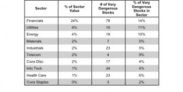
Figure 12 presents a mapping of Very Dangerous stocks by sector. The chart shows the percentage of the value of each sector made up of Very Dangerous stocks, as well as the total number of Very Dangerous stocks in each sector.
The Financials sector has 24% of its value invested in stocks with Very Dangerous ratings.
Figure 12: Distribution of Very Dangerous Stocks by Sector
 Source: New Constructs, LLC and company filings
Figure 13 presents the data charted in Figure 12.
Figure 13: Distribution of Very Dangerous Stocks by Sector
 Source: New Constructs, LLC and company filings
Disclosure: I own GOOG, LO, INTC, ORCL, and WAG. I receive no compensation to write about any specific stock, sector or theme.