Each quarter, we provide the most comprehensive review of equity ETFs and mutual funds available. We review the Best & Worst ETFs and Mutual Funds by sector and style. We also identify the overall best sectors and investment styles for ETFs and for mutual funds. We begin the 4Q12 series with our Sector Rankings report. Over the next two weeks, we will publish 20+ reports on each sector and style. We will also publish a Style Rankings report and a review of how well investors allocate assets to the best ETFs & funds.
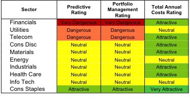
At the outset of the fourth quarter of 2012, only a single sector earns an Attractive rating. My sector ratings are based on the aggregation of my fund ratings for every ETF and mutual fund in each sector.
Investors looking for quality sector funds that hold quality stocks should look no further than the Consumer Staples sector. None of the other sectors earn an Attractive-or-better rating. Figures 6 and 7 provide details. The primary driver behind an Attractive fund rating is good portfolio management, or good stock picking, with low total annual costs
Note that the Attractive-or-better Predictive ratings do not always correlate with Attractive-or-better total annual costs. This fact underscores that (1) low fees can dupe investors and (2) investors should invest only in funds with good stocks and low fees.
See Figures 4 through 13 for a detailed breakdown of ratings distributions by sector. See my free ETF & mutual fund screener for free rankings and ratings on 7000+ mutual funds and 400+ ETFs. My fund rating methodology is detailed here.
All of my reports on the best & worst ETFs and mutual funds in every sector and investment style are available here.
Figure 1: Ratings For All Sectors
To earn an Attractive-or-better Predictive Rating, an ETF or mutual fund must have high-quality holdings and low costs. Only 30 sector ETFs and mutual funds meet these requirements, which is only 10% of all sector ETFs and mutual funds.
Health Care Select Sector SPDR (XLV) is my top Health Care ETF. It is the only ETF or Mutual Fund to get my Very Attractive rating by allocating over 67% of its value to Attractive-or-better-rated stocks.
Johnson & Johnson (JNJ) is one of my favorite stocks held by XLV. Johnson & Johnson is essentially a holding company with over 250 units in three different operating segments: Consumer Products, Pharmaceuticals, and Medical Devices. Unlike some other large multinational holding companies, over the last decade JNJ has seen consistent NOPAT growth, widening margins, and returns on invested capital over 16% in every year of my model. Despite this track record of superb performance, the current market price implies JNJ’s profits will decline 26% and never grow again. Low expectations for a great company make JNJ an attractive holding right now.
Ivy Funds: Ivy Real Estate Securities Fund (IRSAX) is my worst rated Financials mutual fund. It gets my Very Dangerous rating by allocating over 89% of its value to Dangerous or Very Dangerous rated stocks, and does not hold any stocks that we rate Attractive-or-better. To make matters worse, IRSAX charges annual costs of 4.29%, higher than more than 95% of all ETFs and mutual funds. Investors should not pay such a high price to own Dangerous-or-worse rated stocks.
Simon Property Group (SPG) is one of my least favorite stocks held by IRSAX. SPG earns my Very Dangerous rating. One of the reasons why it’s so dangerous is that SPG’s returns on invested capital have not exceeded its WACC in a single year of my model. Companies must earn an ROIC greater than WACC in order to create value for their shareholders. Worst of all, SPG’s stock is expensive right now. In order to justify its current valuation, SPG needs to grow its profits by 15% compounded annually for the next 15 years. Those are lofty expectations for a company with mediocre-at-best profits.
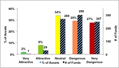
Figure 2 shows the distribution of our Predictive Ratings for all Sector-based ETFs and mutual funds.
Figure 2: Distribution of ETFs & Mutual Funds (Assets and Count) by Predictive Rating
Figure 3 offers additional details on the quality of the sector funds. Note that the average Total Annual Cost of Very Dangerous funds is almost 6 times that of Very Attractive funds.
Figure 3: Predictive Rating Distribution Stats

Source: New Constructs, LLC and company filings
This table shows that only the best of the best funds get our Very Attractive Rating: they must hold good stocks AND have low costs. Investors deserve to have the best of both and we are here to give it to them.
Ratings by Sector
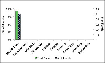
Figure 4 presents a mapping of Very Attractive funds by sector. The chart shows the number of Very Attractive funds in each sector and the percentage of assets allocated to Very Attractive-rated funds in each sector.
There are no sectors that earn my Very Attractive rating. Only one fund in my entire coverage universe earns my Very Attractive rating.
Figure 4: Very Attractive ETFs & Mutual Funds by Sector
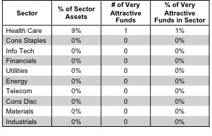
Figure 5 presents the data charted in Figure 4
Figure 5: Very Attractive ETFs & Mutual Funds by Sector
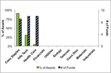
Figure 6 presents a mapping of Attractive funds by sector. The chart shows the number of Attractive funds in each sector and the percentage of assets allocated to Attractive-rated funds in each sector.
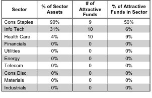
Note that Consumer Staples, Information Technology, and Health Care are the only sectors with Attractive-rated funds.
Figure 6: Attractive ETFs & Mutual Funds by Sector
Figure 7 presents the data charted in Figure 6.
Figure 7: Attractive ETFs & Mutual Funds by Sector
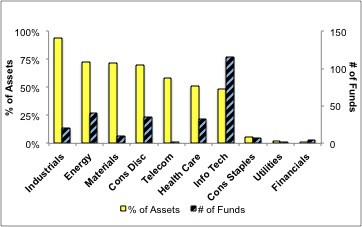
Figure 8 presents a mapping of Neutral funds by sector. The chart shows the number of Neutral funds in each sector and the percentage of assets allocated to Neutral-rated funds in each sector.
Figure 8: Neutral ETFs & Mutual Funds by Sector
Figure 9 presents the data charted in Figure 8.
Figure 9: Neutral ETFs & Mutual Funds by Sector
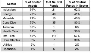
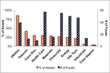
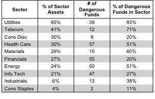
Figure 10 presents a mapping of Dangerous funds by fund sector. The chart shows the number of Dangerous funds in each sector and the percentage of assets allocated to Dangerous-rated funds in each sector.
Utilities ETFs and mutual funds should be avoided. 83% of assets in Utilities ETFs and mutual funds are allocated to Dangerous stocks.
Figure 10: Dangerous ETFs & Mutual Funds by Sector
Figure 11 presents the data charted in Figure 10.
Figure 11: Dangerous ETFs & Mutual Funds by Sector
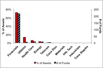
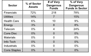
Figure 12 presents a mapping of Very Dangerous funds by fund sector. The chart shows the number of Very Dangerous funds in each sector and the percentage of assets allocated to Very Dangerous-rated funds in each sector.
Financials ETFs and mutual funds hold the greatest number Very Dangerous stocks, making Financials the only Very Dangerous sector category. 78% of Financials ETFs and mutual funds earn my Very Dangerous rating.
Figure 12: Very Dangerous ETFs & Mutual Funds by Sector
Figure 13 presents the data charted in Figure 12.
Figure 13: Very Dangerous ETFs & Mutual Funds by Sector
Disclosure: I own JNJ. I receive no compensation to write about any specific stock, sector or theme.
