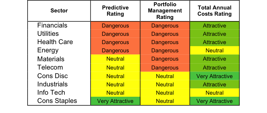
At the beginning of the first quarter of 2015, only the Consumer Staples sector earns an Attractive-or-better rating. Sector ratings are based on the aggregation of our fund ratings for every ETF and mutual fund in each sector.
Investors looking for sector funds that hold quality stocks should look no further than the Consumer Staples and Information Technology sectors. These sectors house the most Attractive-or-better rated funds. Figures 4 and 7 provide details. The primary driver behind an Attractive fund rating is good portfolio management, or good stock picking, with low total annual costs.
Note that the Attractive-or-better Predictive ratings do not always correlate with Attractive-or-better total annual costs. This fact underscores that (1) cheap funds can dupe investors and (2) investors should invest only in funds with good stocks and low fees.
See Figures 4 through 13 for a detailed breakdown of ratings distributions by sector. Platinum members have access to comprehensive reports on all sectors and investment styles.
Figure 1: Ratings For All Sectors
To earn an Attractive-or-better Predictive Rating, an ETF or mutual fund must have high-quality holdings and low costs. Only the top 30% of all ETFs and mutual funds earn our Attractive or better ratings.
Fidelity MSCI Consumer Staples Index ETF (FSTA) is our top rated Consumer Staples fund. It gets our Very Attractive rating by allocating over 27% of its value to Attractive-or-better-rated stocks.
Walmart (WMT) is one of my favorite stocks held by FSTA. Walmart has long been one of my favorite stocks, and remains a leader in the retail industry. While 2014 financial results had a few hiccups, a strong holiday season and new initiatives have positioned Walmart well going into 2015. As history has shown us, Walmart is able to handle the changing retail environment and continue creating profit growth. Over the past decade, Walmart has grown after-tax profit (NOPAT) by 7% compounded annually. With over $14 billion in free cash flow (FCF) in 2014, as well as a return on invested capital (ROIC) of 12%, Walmart not only has the ability to explore future growth options, but has proven to generate high returns on money invested into the business.
At its current price of ~$86/share, Walmart has a price to economic book value (PEBV) ratio of 1.0. This ratio implies the market expects Walmart to never meaningfully grow NOPAT again. This expectation flies in the face of Walmart’s impressive history of profitability. Walmart is excelling in its core business and expanding into other spaces, and should easily surpass such low expectations this year.
Rydex Real Estate Fund (RYREX) is my worst Financials fund. It gets my Very Dangerous rating by allocating over 63% of its value to Dangerous-or-worse-rated stocks, and to make matters worse, charges investors annual costs of 7.85%.
Crown Castle International Corporation (CCI) is one of my least favorite stocks held by RYREX and gets my Dangerous rating. Crown Castle has been rapidly spending money for years, but is failing to increase profits. Over the past three years, Crown Castle has increased its invested capital by 39% compounded annually. However, NOPAT has increased only 2% over the same time period. This expansion of the balance sheet without any increases in profits, has also led to Crown Castle earning a bottom-quintile ROIC of 3%.The company is rapidly bleeding cash, with -$5 billion in free cash flow last year.
Despite these glaring issues, the market has priced Crown Castle for further growth. To justify its current valuation of ~$79/share, CCI must grow NOPAT by 10% compounded annually for the next 15 years. Crown Castle has given investors reason to be cautious about its ability to grow profits, and with negative free cash flow, meeting future obligations may become difficult for the company. Investors should avoid Crown Castle.
Figure 2 shows the distribution of our Predictive Ratings for all sector ETFs and mutual funds.
Figure 2: Distribution of ETFs & Mutual Funds (Assets and Count) by Predictive Rating
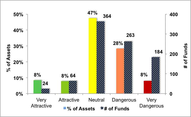
Figure 3 offers additional details on the quality of the sector funds. Note that the average Total Annual Cost of Very Dangerous funds is over seven times that of Very Attractive funds.
Figure 3: Predictive Rating Distribution Stats
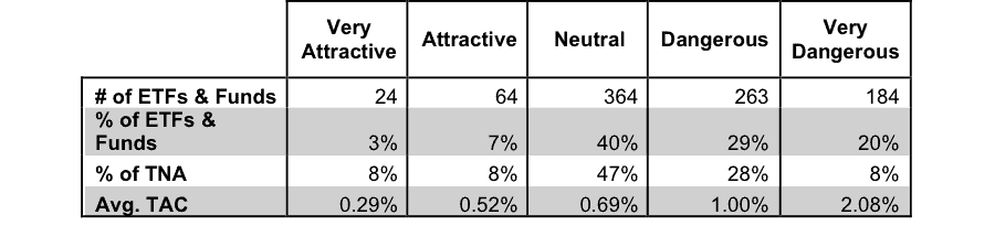
* Avg TAC = Weighted Average Total Annual Costs
Ratings by Sector
Figure 4 presents a mapping of Very Attractive funds by sector. The chart shows the number of Very Attractive funds in each sector and the percentage of assets in each sector allocated to funds that are rated Very Attractive.
One interesting note is that over 40% of assets are held in only 8% of the funds in the Information Technology sector.
Figure 4: Very Attractive ETFs & Mutual Funds by Sector
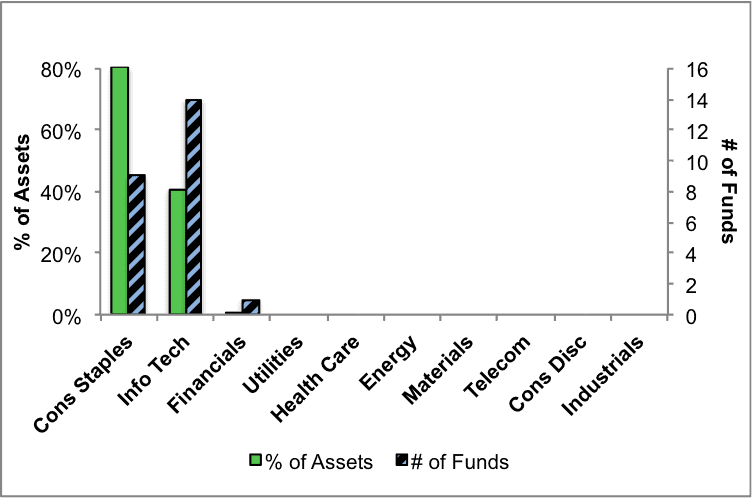
Figure 5 presents the data charted in Figure 4.
Figure 5: Very Attractive ETFs & Mutual Funds by Sector
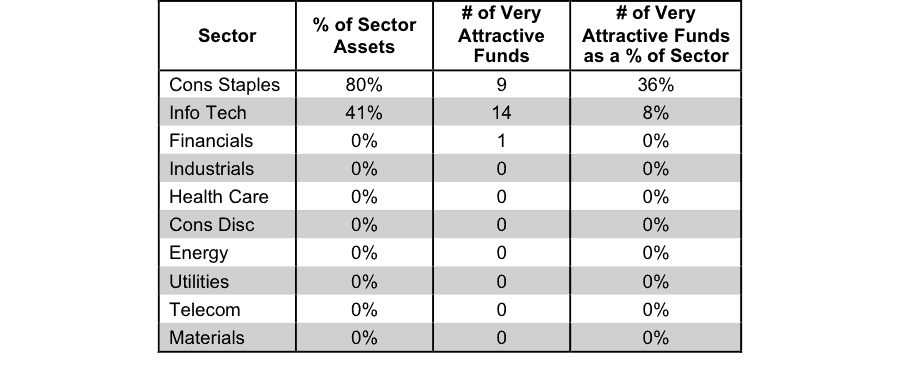
Figure 6 presents a mapping of Attractive funds by sector. The chart shows the number of Attractive funds in each sector and the percentage of assets allocated to Attractive-rated funds in each sector.
Figure 6: Attractive ETFs & Mutual Funds by Sector
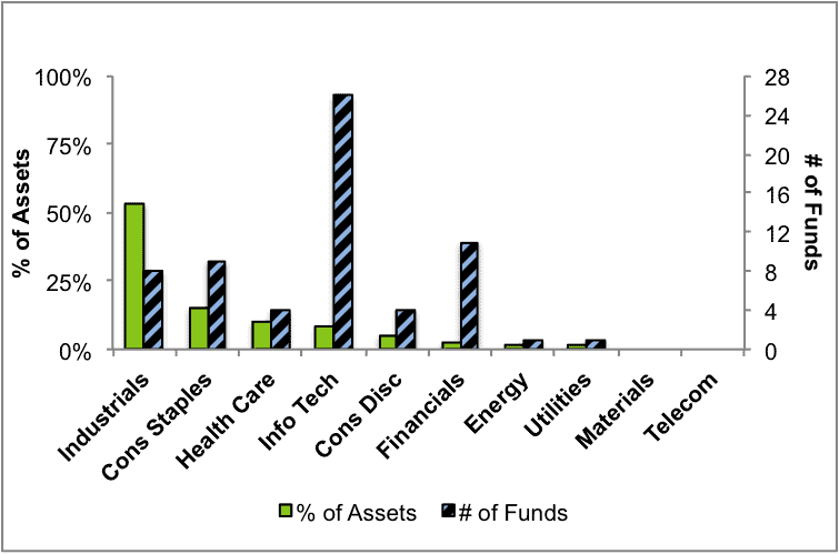
Figure 7 presents the data charted in Figure 6.
Figure 7: Attractive ETFs & Mutual Funds by Sector
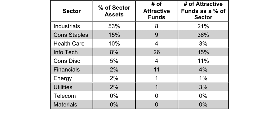
Figure 8 presents a mapping of Neutral funds by sector. The chart shows the number of Neutral funds in each sector and the percentage of assets allocated to Neutral-rated funds in each sector.
Figure 8: Neutral ETFs & Mutual Funds by Sector
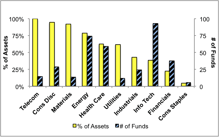
Figure 9 presents the data charted in Figure 8.
Figure 9: Neutral ETFs & Mutual Funds by Sector
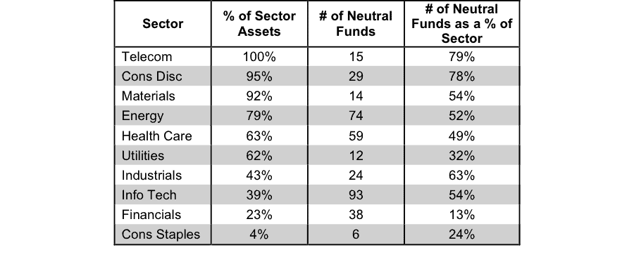
Figure 10 presents a mapping of Dangerous funds by fund sector. The chart shows the number of Dangerous funds in each sector and the percentage of assets allocated to Dangerous-rated funds in each sector.
The landscape of sector ETFs and mutual funds is littered with Dangerous funds. Investors in Financials funds have put over 68% of their assets in Dangerous-rated funds.
Figure 10: Dangerous ETFs & Mutual Funds by Sector
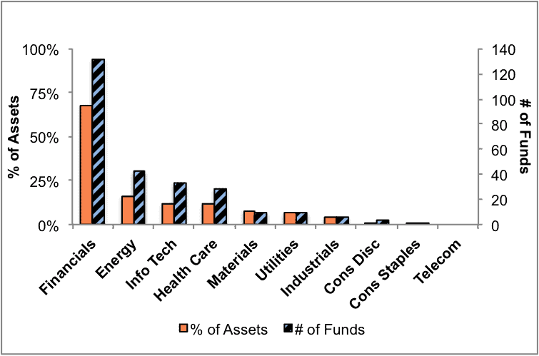
Figure 11 presents the data charted in Figure 10.
Figure 11: Dangerous ETFs & Mutual Funds by Sector
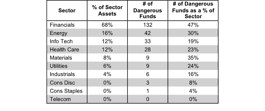
Figure 12 presents a mapping of Very Dangerous funds by fund sector. The chart shows the number of Very Dangerous funds in each sector and the percentage of assets in each sector allocated to funds that are rated Very Dangerous.
Taking into account the number of Dangerous funds from above, as well as the number of Very Dangerous funds shown below, the Financials sector has over 230 Dangerous-or-worse rated funds. Buyer beware.
Figure 12: Very Dangerous ETFs & Mutual Funds by Sector
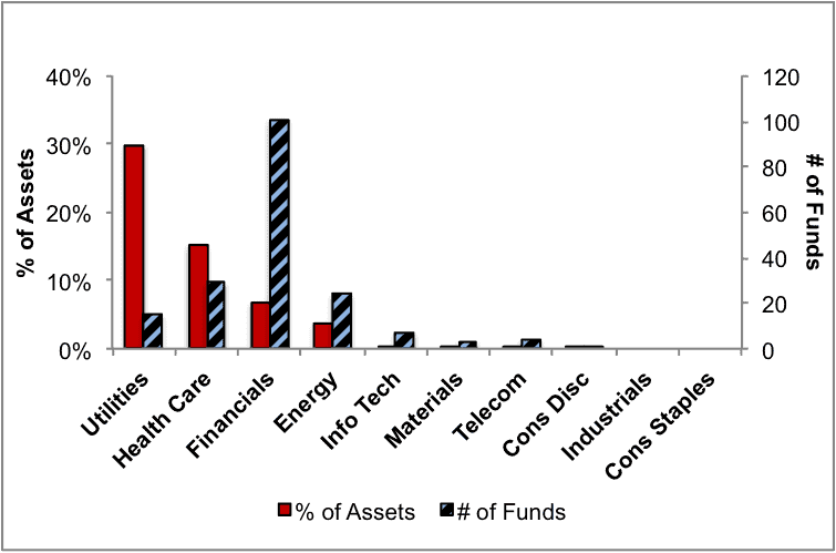
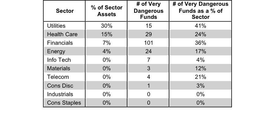
Figure 13 presents the data charted in Figure 12.
Figure 13: Very Dangerous ETFs & Mutual Funds by Sector
All figures sourced from New Constructs, LLC and company filings.
Kyle Guske II contributed to this report
Disclosure: David Trainer is long WMT. David Trainer and Kyle Guske II receive no compensation to write about any specific stock, sector or theme.
2 replies to "1Q15 Sector Ratings for ETFs & Mutual Funds"
do you have stock & EFT’s by symbol or Name listed in “attractive &/or dangerous”?
James,
Yes we do. You can find all of the stocks and ETFs that we cover — by name and by ticker — in our stock and fund screener that you can find here: https://client.newconstructs.com/nc/stockscreener/stock-screener.htm.