Each quarter, we provide the most comprehensive review of equity ETFs and mutual funds available. We review the Best & Worst ETFs and Mutual Funds by sector and style. We also identify the overall best sectors and investment styles for ETFs and for mutual funds. We begin the 3Q12 series with our Sector Roadmap report. Over the next two weeks, we will publish 20+ reports on each sector and style. We will also publish a Style Roadmap report and a review of how well investors allocate assets to the best ETFs & funds.
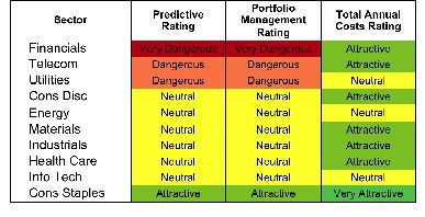
Only one sector, Consumer Staples, earns my Attractive rating. See Figure 1 for my rankings of all ten sectors. My sector ratings are based on the aggregation of my fund ratings for every ETF and mutual fund in each sector.
Investors looking for quality sector funds that hold quality stocks should look no further than the Consumer Staples, Information Technology and Health Care sectors. These three sectors house 33 of the 37 Attractive-or-better rated funds. Figures 4 and 6 provide details. The primary drivers behind an Attractive fund rating are good portfolio management, or good stock picking, and low total annual costs.
See Figures 4 through 13 for a detailed breakdown of ratings distributions by sector. See my free ETF & mutual fund screener for rankings, ratings and free reports on 7000+ mutual funds and 400+ ETFs. My fund rating methodology is detailed here.
All of my reports on the best & worst ETFs and mutual funds in every sector and investment style are available on my blog.
Figure 1: Ratings For All Sectors
To earn an Attractive-or-better Predictive Rating, an ETF or mutual fund must have high-quality holdings and low costs. Only 37 sector ETFs and mutual funds meet these requirements, which is only 5% of all sector ETFs and mutual funds.
ICON Funds: ICON Consumer Staples Fund (ICLEX) is once again, my top Consumer Staples mutual fund. It earns my Attractive rating by allocating nearly 70% of its value to Attractive-or-better-rated stocks.
Procter & Gamble Company (PG) is one of my favorite stocks held by ICLEX. PG earns my Attractive rating because of its solid track record and the market’s pessimistic view of future performance. PG’s current stock price (~$61.55) implies that profits will permanently decline by 10%. These are low expectations for such a consistent cash flow generator.
Rydex Series Funds: Real Estate Fund (RYREX) is my worst Financials mutual fund. It earns my Very Dangerous rating by allocating over 85% of its value to Dangerous-or-worse-rated stocks, and to make matters worse, charges investors annual costs of 8.39%.
Ventas Inc. (VTR) is one of my least favorite stocks held RYREX. It earns my Very Dangerous rating because of misleading earnings and an expensive valuation. VTR has failed to earn a return on invested capital (ROIC) sufficient enough to cover its weighted average cost of capital (WACC) three of the past four years. Its current valuation implies the company will grow profits (NOPAT) at over 40% compounded annually for the next 10 years. Hard to see how the stock could do anything but go down from there.
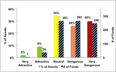
Figure 2 shows the distribution of our Predictive Ratings for all sector ETFs and mutual funds.
Figure 2: Distribution of ETFs & Mutual Funds (Assets and Count) by Predictive Rating
Figure 3 offers additional details on the quality of the sector funds. Note that the average Total Annual Cost of Very Dangerous funds is almost 6 times that of Very Attractive funds.
Figure 3: Predictive Rating Distribution Stats

Source: New Constructs, LLC and company filings
This table shows that only the best of the best funds get our Very Attractive Rating: they must hold good stocks AND have low costs. Investors deserve to have the best of both and we are here to give it to them.
Ratings by Sector
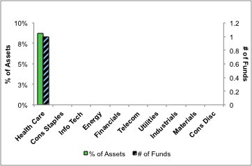
Figure 4 presents a mapping of Very Attractive funds by sector. The chart shows the number of Very Attractive funds in each sector and the percentage of assets allocated to Very Attractive-rated funds in each sector.
Only one sector fund earns my Very Attractive rating.
Figure 4: Very Attractive ETFs & Mutual Funds by Sector
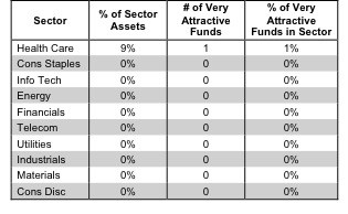
Figure 5 presents the data charted in Figure 4
Figure 5: Very Attractive ETFs & Mutual Funds by Sector
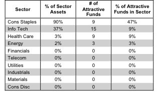
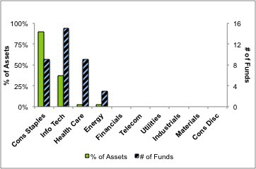
Figure 6 presents a mapping of Attractive funds by sector. The chart shows the number of Attractive funds in each sector and the percentage of assets allocated to Attractive-rated funds in each sector.
Note that only the Consumer Staples, Information Technology, Health Care and Energy sectors house Attractive-rated funds. No other sectors house ETFs or mutual funds worthy of investment.
Figure 6: Attractive ETFs & Mutual Funds by Sector
Figure 7 presents the data charted in Figure 6.
Figure 7: Attractive ETFs & Mutual Funds by Sector
Figure 8 presents a mapping of Neutral funds by sector. The chart shows the number of Neutral funds in each sector and the percentage of assets allocated to Neutral-rated funds in each sector.
Figure 8: Neutral ETFs & Mutual Funds by Sector
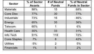
Figure 9 presents the data charted in Figure 8.
Figure 9: Neutral ETFs & Mutual Funds by Sector
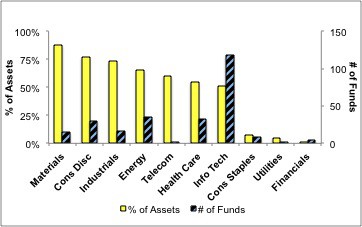
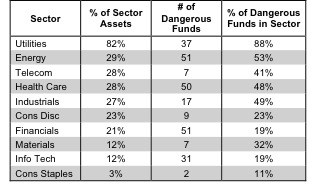
Figure 10 presents a mapping of Dangerous funds by fund sector. The chart shows the number of Dangerous funds in each sector and the percentage of assets allocated to Dangerous-rated funds in each sector.
The Utilities, Energy, Telecom, Health Care, and Industrials house at least 25% of their value in Dangerous-rated funds.
Figure 10: Dangerous ETFs & Mutual Funds by Sector
Figure 11 presents the data charted in Figure 10.
Figure 11: Dangerous ETFs & Mutual Funds by Sector
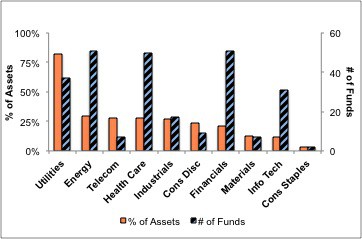
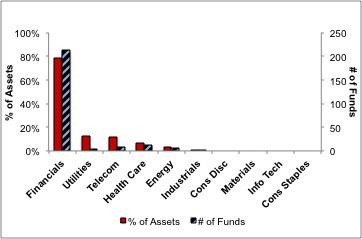
Figure 12 presents a mapping of Very Dangerous funds by fund sector. The chart shows the number of Very Dangerous funds in each sector and the percentage of assets allocated to Very Dangerous-rated funds in each sector.
Figure 12: Very Dangerous ETFs & Mutual Funds by Sector
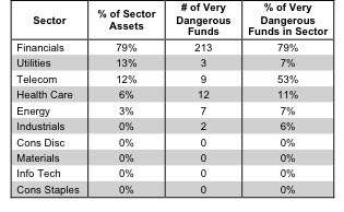
Figure 13 presents the data charted in Figure 12.
Figure 13: Very Dangerous ETFs & Mutual Funds by Sector
