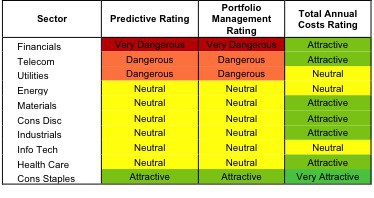
Only one sector, Consumer Staples, earns my Attractive rating. See Figure 1 for my ranking of all ten sectors. My sector ratings are based on the aggregation of my fund ratings for every ETF and mutual fund in each each sector.
Investors looking for the best sector ETF and mutual funds should focus on the Consumer Staples sector.
The Consumer Staples sector earns my Attractive rating by allocating 95% of its assets to funds with an Attractive rating. Figures 6 and 7 provide details. The primary driver behind an Attractive fund rating is a good portfolio management, or good stock picking, with low total annual costs.
See Figures 4 through 13 for a detailed breakdown of ratings distributions by sector. See my free ETF & mutual fund screener for rankings, ratings and free reports on 7000+ mutual funds and 400+ ETFs.
Reports on the best & worst ETS and mutual funds in every sector and style are available on my blog and MarketWatch’s Trading Deck
Figure 1: Ratings For All Sectors
To earn an Attractive-or-better Predictive Rating, an ETF or mutual fund must have high-quality holdings and low costs. Only 29 sector ETF and mutual funds meet these requirements, which is only 12% of all sector ETF and mutual funds.
ICON Funds: ICON Consumer Staples Fund [s: ICLEX] is my top Consumer Staples fund. It gets my Attractive rating by allocating over 73% of its value to Attractive-or-better-rated stocks.
Wal-Mart Stores, Inc. [s: WMT] is one of my favorite stocks held by ICLEX. WMT has a proven business model and consistently demonstrates its ability to dominate the consumer staples industry. Wal-Mart’s current stock price implies that the company’s profits will decline by 30% permanently. These are stunningly low expectations for such a consistent cash flow generator, which is what I look for in a good long investment.
Guggenheim Investment Real Estate Fund [s: RYREX] is my worst Financials fund and gets my Very Dangerous rating. RYREX allocates over 84% of its value to Dangerous-or-worse-rated stocks, and to make matters worse, charges investors and arm and a leg to do so.
Simon Property Group Inc. [s: SPG] one of my least favorite stocks held by RYREX. It gets my Very Dangerous rating because of misleading earnings and an expensive valuation. To justify its current stock price of $145.73, the company must grow its profits by 14% compounded annually for 20 years. These are lofty expectations given that, since 1998, the company has achieved double-digit revenue growth only twice and has grown NOPAT at about 9% compounded annually.
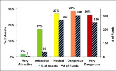
Figure 2 shows the distribution of our Predictive Ratings for all sector ETFs and mutual funds.
Figure 2: Distribution of Funds and Assets by Predictive Rating
Figure 3 offers additional details on the quality of the sector funds. Note that the average Total Annual Cost of Very Dangerous funds is nearly 6 times that of Very Attractive funds.
Source: New Constructs, LLC and company filings
This table shows that only the best of the best funds get our Very Attractive Rating: they must hold good stocks AND have low costs. Investors deserve to have the best of both and we are here to give it to them.
Ratings by Sector
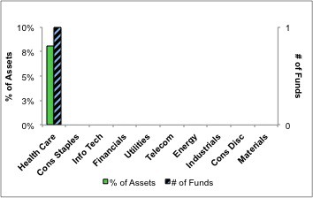
Figure 4 presents a mapping of Very Attractive funds by sector. The chart shows the number of Very Attractive funds in each sector and the percentage of assets allocated to Very Attractive-rated funds in each sector.
Only one sector ETF or mutual fund earns our Very Attractive rating. See my free ETF & mutual fund screener to find out which one.
Figure 4: Very Attractive Funds by Sector
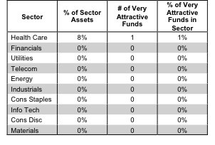
Figure 5 presents the data charted in Figure 4.
Figure 5: Very Attractive Funds by Sector
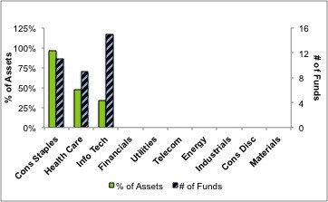
Figure 6 presents a mapping of Attractive funds by sector. The chart shows the number of Attractive funds in each sector and the percentage of assets allocated to Attractive-rated funds in each sector.
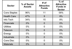
Note that Consumer Staples, Health Care and Info Tech are the only sectors to offer Attractive-rated funds.
Figure 6: Attractive Funds by Sector
Figure 7 presents the data charted in Figure 6.
Figure 7: Attractive Funds by Sector
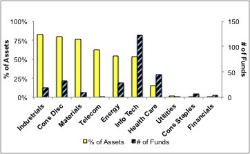
Figure 8 presents a mapping of Neutral funds by sector. The chart shows the number of Neutral funds in each sector and the percentage of assets allocated to Neutral-rated funds in each sector.
Figure 8: Neutral Funds by Sector
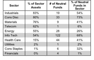
Figure 9 presents the data charted in Figure 8.
Figure 9: Neutral Funds by Sector
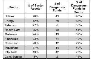
Figure 10 presents a mapping of Dangerous funds by sector. The chart shows the number of Dangerous funds in each sector and the percentage of assets allocated to Dangerous-rated funds in each sector.
The Utilities, Energy, Telecom, and Health Care sectors house at least 25% of their value in Dangerous-rated funds.
Figure 10: Dangerous Funds by Sector
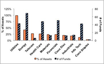
Figure 11 presents the data charted in Figure 10.
Figure 11: Dangerous Funds by Sector
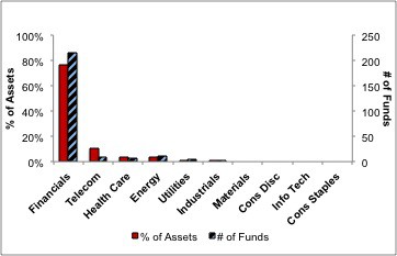
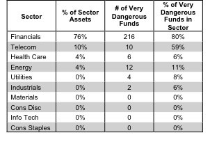
Figure 12 presents a mapping of Very Dangerous funds by sector. The chart shows the number of Very Dangerous funds in each sector and the percentage of assets allocated to Very Dangerous-rated funds in each sector.
The Financials sector has 76% of its assets in funds with Very Dangerous ratings.
