
At the beginning of the first quarter of 2015, only the Large Cap Blend style earns an Attractive-or-better rating. Our style ratings are based on the aggregation of our fund ratings for every ETF and mutual fund in each style.
If you are looking for style funds that hold quality stocks, look no further than the Large Cap Blend and Large Cap Value styles. These styles house the most Attractive-or-better rated funds. Figures 4 through 7 provide details. The primary driver behind an Attractive fund rating is good portfolio management, or good stock picking, with low Total Annual Costs.
Note that the Attractive-or-better Predictive ratings do not always correlate with Attractive-or-better Total Annual Costs. This fact underscores that (1) cheap funds can dupe investors and (2) investors should invest only in funds with good stocks and low fees.
See Figures 4 through 13 for a detailed breakdown of ratings distributions by investment style.
Figure 1: Ratings For All Investment Styles

To earn an Attractive-or-better Predictive Rating, an ETF or mutual fund must have high-quality holdings and low costs. 2166 style ETFs and mutual funds meet these requirements, which is only 33% of all style ETFs and mutual funds.
State Street SPDR Dow Jones Industrial Average (DIA) is the top Large Cap Value ETF and overall top rated style ETF. It gets our Very Attractive rating by allocating over 49% of its value to Attractive-or-better-rated stocks.
Johnson & Johnson (JNJ) is one of our favorite stocks held by DIA and earns a Very Attractive rating. Johnson & Johnson has long been one of our favorites and was even our stock pick of the week in November 2014. Since that call, our sentiment on this company has only been strengthened. On a trailing twelve-month (TTM) basis, Johnson & Johnson has grown after-tax profit (NOPAT) by 20% year over year, increased its return on invested capital (ROIC) to 19% from 15% in 2013, and increased its free cash flow (FCF) to $24 billion. This growth is part of a long, ongoing trend for Johnson & Johnson: Over the past decade, the company has grown NOPAT by 10% compounded annually, grown FCF from $8 billion in 2004, and generated positive and increasing economic earnings for the last 16 years.
These impressive fundamentals support a stock price well above JNJ’s current price. At its current level of ~$102/share, JNJ has a price to economic book value (PEBV) ratio of 0.9. This ratio implies the market expects Johnson & Johnson’s NOPAT to permanently decline by 10%. This expectation flies in the face of the 20% growth seen most recently and of the 10% historical NOPAT growth rate over the past decade. JNJ is providing a great entry point at its current discounted price.
Northern Lights Footprints Discover Value Fund (DAVAX) is our worst All Cap Blend mutual fund, and overall worst rated mutual fund. It gets our Very Dangerous rating by allocating over 78% of its value to Neutral-or-worse-rated stocks, and to make matters worse, charges investors annual costs of 5.45%.
Sigma Designs (SIGM) is one of my least favorite stocks held by DAVAX and earns our Dangerous rating. Sigma, a provider of system chips for TVs, set top boxes, and home automation devices, has a poor track record and wildly inflated valuation. Since 2010, Sigma’s NOPAT has been in sharp decline. After earnings $27 million in NOPAT in 2010, Sigma lost -$5 million in 2013, and on a current TTM basis sits at -$16 million. Sigma’s ROIC has followed this path, declining to -6% TTM, down from 1% in 2010. Sigma has also generated negative economic earnings each of the last five years. Despite the poor state of the company in regards to its fundamentals, the company is overvalued. In order to justify its current price of ~$7/share, Sigma must grow revenue by 20% compounded annually for the next 20 years. This seems unlikely given that over the past five years, Sigma’s revenue has actually declined by 1% compounded annually. Avoid Sigma Designs, especially in the semiconductor industry, which offers many better investments.
Figure 2 shows the distribution of our Predictive Ratings for all investment style ETFs and mutual funds.
Figure 2: Distribution of ETFs & Mutual Funds (Assets and Count) by Predictive Rating
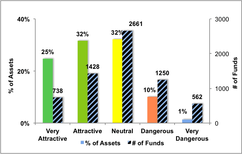
Figure 3 offers additional details on the quality of the investment style funds. Note that the average Total Annual Cost of Very Dangerous funds is almost 10 times that of Very Attractive funds.
Figure 3: Predictive Rating Distribution Stats
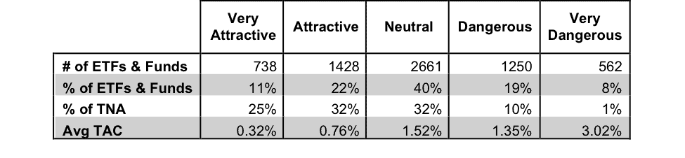
* Avg TAC = Weighted Average Total Annual Costs
This table shows that only the best of the best funds get our Very Attractive Rating: they must hold good stocks AND have low costs. Investors deserve to have the best of both and we are here to give it to them.
Ratings by Investment Style
Figure 4 presents a mapping of Very Attractive funds by investment style. The chart shows the number of Very Attractive funds in each investment style and the percentage of assets in each style allocated to funds that are rated Very Attractive.
Only 738 investment style funds earn our Very Attractive rating.
Figure 4: Very Attractive ETFs & Mutual Funds by Investment Style
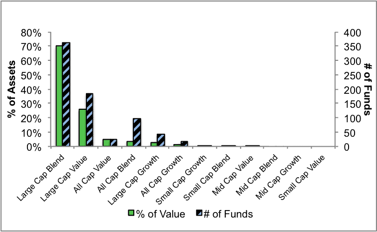
Figure 5 presents the data charted in Figure 4
Figure 5: Very Attractive ETFs & Mutual Funds by Investment Style
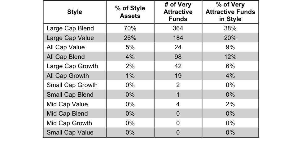
Figure 6 presents a mapping of Attractive funds by investment style. The chart shows the number of Attractive funds in each style and the percentage of assets allocated to Attractive-rated funds in each style.
Note that the Large Cap Blend and Large Cap Value have the most Attractive-rated funds.
Figure 6: Attractive ETFs & Mutual Funds by Investment Style
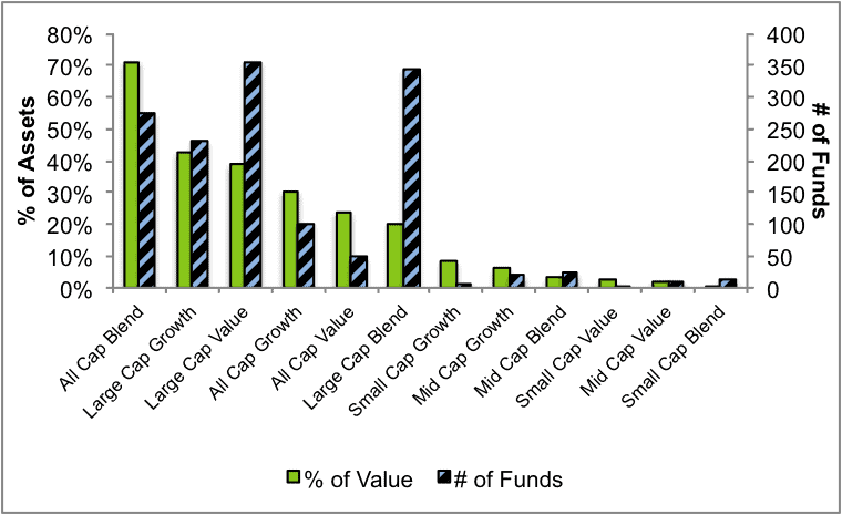
Figure 7 presents the data charted in Figure 6.
Figure 7: Attractive ETFs & Mutual Funds by Investment Style
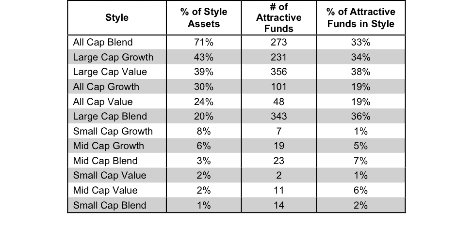
Figure 8 presents a mapping of Neutral funds by investment style. The chart shows the number of Neutral funds in each investment style and the percentage of assets allocated to Neutral-rated funds in each style.
Figure 8: Neutral ETFs & Mutual Funds by Investment Style
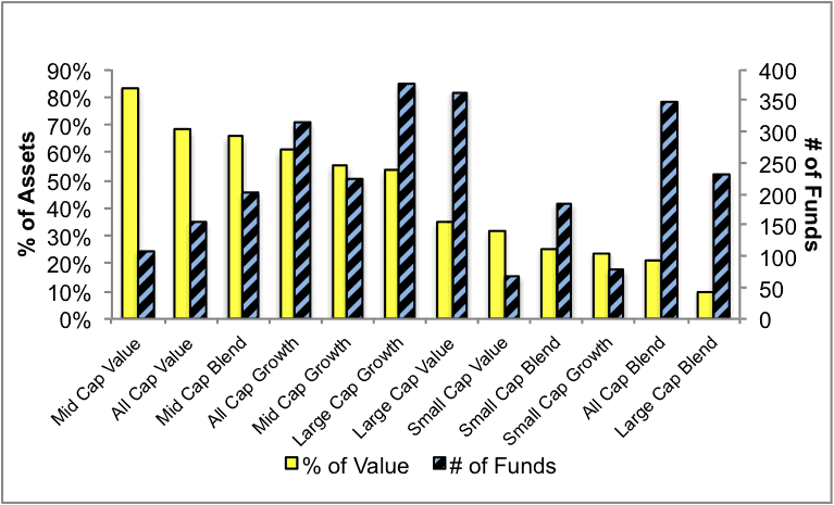
Figure 9 presents the data charted in Figure 8.
Figure 9: Neutral ETFs & Mutual Funds by Investment Style
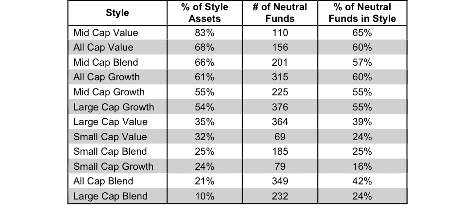
Figure 10 presents a mapping of Dangerous funds by fund style. The chart shows the number of Dangerous funds in each investment style and the percentage of assets allocated to Dangerous-rated funds in each style.
Take note of the many Dangerous rated Small Cap ETFs and mutual funds.
Figure 10: Dangerous ETFs & Mutual Funds by Investment Style
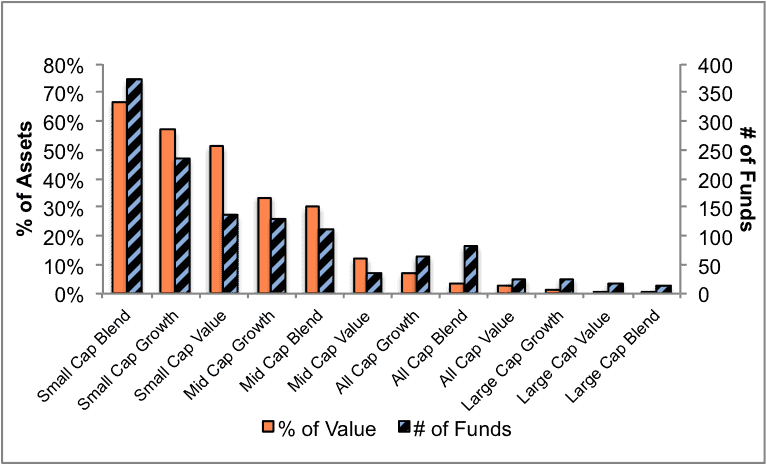
Figure 11 presents the data charted in Figure 10.
Figure 11: Dangerous ETFs & Mutual Funds by Investment Style
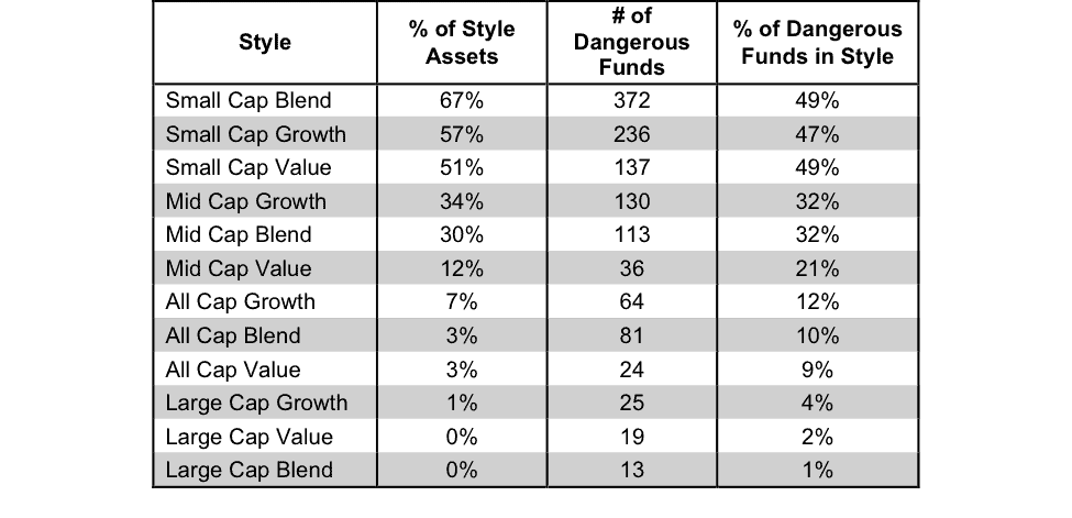
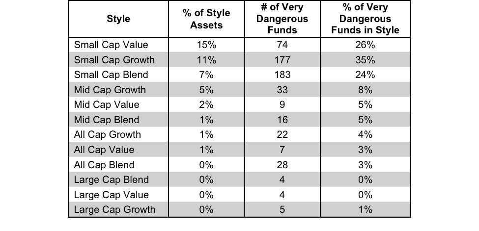
Figure 12 presents a mapping of Very Dangerous funds by fund style. The chart shows the number of Very Dangerous funds in each investment style and the percentage of assets in each style allocated to funds that are rated Very Dangerous.
Figure 12: Very Dangerous ETFs & Mutual Funds by Investment Style
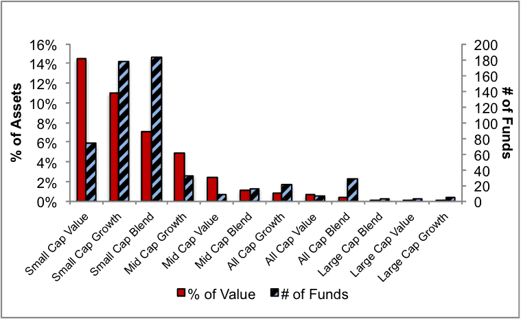
Figure 13 presents the data charted in Figure 12.
Figure 13: Very Dangerous ETFs & Mutual Funds by Investment Style
Sources for figures 1-13: New Constructs, LLC and company filings
Kyle Guske II contributed to this report.
Disclosure: David Trainer owns JNJ. David Trainer and Kyle Guske II receive no compensation to write about any specific stock, sector or theme.