At the beginning of the second quarter of 2015, only the Consumer Staples sector earns an Attractive or better rating. Our sector ratings are based on the aggregation of our fund ratings for every ETF and mutual fund in each sector.
Investors looking for sector funds that hold quality stocks should look no further than the Consumer Staples sector. This sector houses the most Attractive-or-better rated funds. Figures 6 and 7 provide details. The primary driver behind an Attractive fund rating is good portfolio management, or good stock picking, with low total annual costs.
Note that the Attractive-or-better Predictive ratings do not always correlate with Attractive-or-better total annual costs. This fact underscores that (1) cheap funds can dupe investors and (2) investors should invest only in funds with good stocks and low fees.
See Figures 4 through 13 for a detailed breakdown of ratings distributions by sector. See our ETF & mutual fund screener for rankings, ratings and reports on 7000+ mutual funds and 400+ ETFs. Our fund rating methodology is detailed here.
All of our reports on the best & worst ETFs and mutual funds in every sector are here.
Figure 1: Ratings for All Sectors
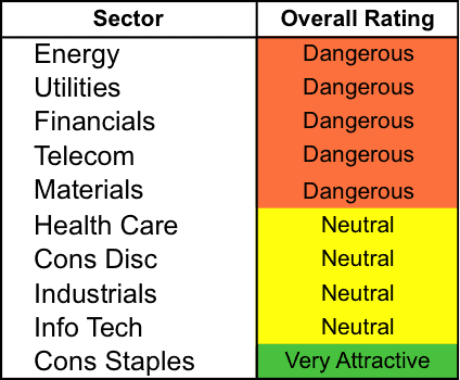
Source: New Constructs, LLC and company filings
To earn an Attractive-or-better Predictive Rating, an ETF or mutual fund must have high-quality holdings and low costs. Only the top 30% of all ETFs and mutual funds earn our Attractive or better ratings.
State Street SPDR Consumer Staples Select Sector Fund (XLP) is our top rated Consumer Staples fund. It gets our Very Attractive rating by allocating almost 40% of its value to Attractive-or-better-rated stocks.
Walmart (WMT) is one of our favorite stocks held by XLP. Walmart has long been one of our favorite stocks, and it remains a leader in the retail industry. While the company’s 2014 financial results had a few hiccups, a strong competitive advantage and new initiatives have positioned Walmart well going into 2015. As history has shown us, Walmart is able to handle the changing retail environment and continue creating profit growth. Since 2008, Walmart has grown after-tax profit (NOPAT) by 4% compounded annually. With over $19 billion in free cash flow (FCF) on a trailing 12-month (TTM) basis and a return on invested capital (ROIC) of 11%, Walmart not only has the ability to explore future growth options, but has proven its ability to generate high returns on money invested into the business.
At its current price of ~$83/share, Walmart has a price to economic book value (PEBV) ratio of 0.9. This ratio implies that the market expects Walmart’s NOPAT to permanently decline by 10%. This expectation flies in the face of Walmart’s impressive history of profitability. Walmart is excelling in its core business and expanding into other spaces, and should easily surpass such low expectations this year.
Forward Real Estate Fund (KREAX) is our worst Financials fund. It gets our Very Dangerous rating by allocating over 60% of its value to Dangerous-or-worse-rated stocks, and to make matters worse, charges investors total annual costs of 4.29%.
Health Care REIT (HCN) is one of our least favorite stocks held by KREAX and earns our Dangerous rating. Health Care REIT had an exceptional year in 2014 and NOPAT rose over 234%. However, profit growth over the long term is decidedly less impressive, coming in at 14% compounded annually. Despite this profit growth, HCN earns a ROIC of just 4%, which puts the company in the bottom quintile of all companies we cover.
To justify its current price of $77/share, Health Care REIT must grow NOPAT by 22% compounded annually over the next 13 years. This level of growth is out of reach for most companies, let alone a REIT in a market with uncertain interest rates. There’s also the fact that while many investors have flocked to REITs for their dividends in this low-interest rate area, HCN’s dividend doesn’t look so good when you consider that it hasn’t had negative free cash flow since 2001. Investors should avoid HCN.
Figure 2 shows the distribution of our Predictive Ratings for all sector ETFs and mutual funds.
Figure 2: Distribution of ETFs & Mutual Funds (Assets and Count) by Predictive Rating
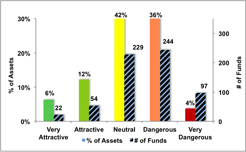
Source: New Constructs, LLC and company filings
Figure 3 offers additional details on the quality of the sector funds. Note that the average total annual cost of Very Dangerous funds is almost 9 times that of Attractive funds.
Figure 3: Predictive Rating Distribution Stats
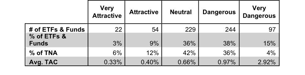 * Avg TAC = Weighted Average Total Annual Costs
Source: New Constructs, LLC and company filings
This table shows that only the best of the best funds get our Very Attractive rating: they must hold good stocks AND have low costs. Investors deserve to have the best of both and we are here to give it to them.
Ratings by Sector
Figure 4 presents a mapping of Very Attractive funds by sector. The chart shows the number of Very Attractive funds in each sector and the percentage of assets in each sector allocated to funds that are rated Very Attractive.
Figure 4: Very Attractive ETFs & Mutual Funds by Sector
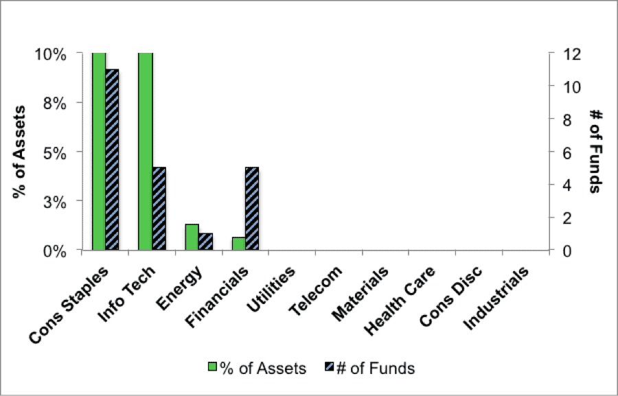
Source: New Constructs, LLC and company filings
Figure 5 presents the data charted in Figure 4.
Figure 5: Very Attractive ETFs & Mutual Funds by Sector
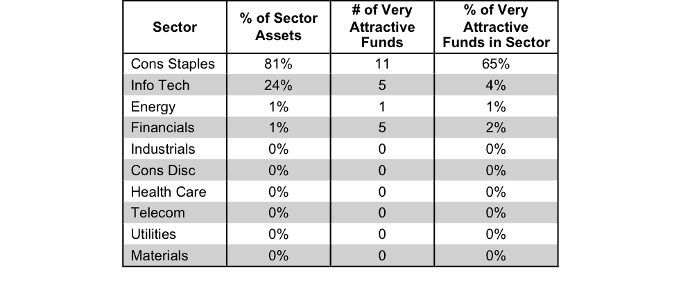
Source: New Constructs, LLC and company filings
Figure 6 presents a mapping of Attractive funds by sector. The chart shows the number of Attractive funds in each sector and the percentage of assets allocated to Attractive-rated funds in each sector.
Figure 6: Attractive ETFs & Mutual Funds by Sector
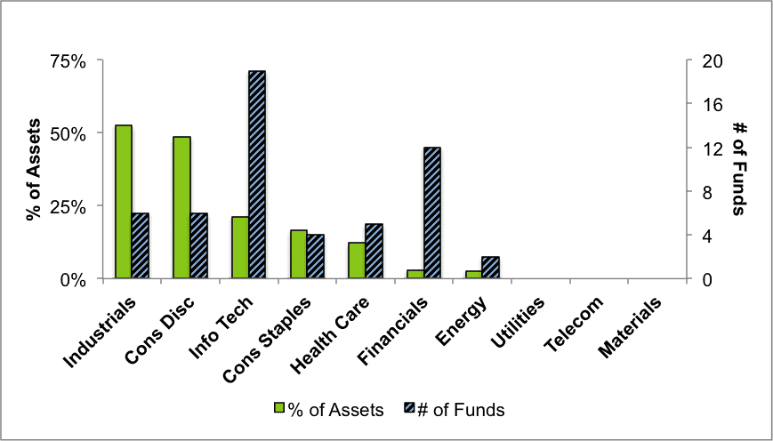
Source: New Constructs, LLC and company filings
Figure 7 presents the data charted in Figure 6
Figure 7: Attractive ETFs & Mutual Funds by Sector
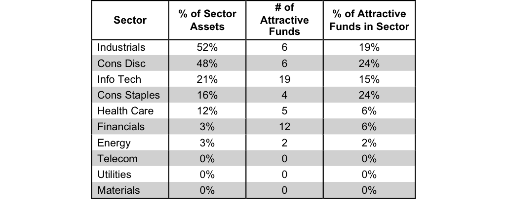
Source: New Constructs, LLC and company filings
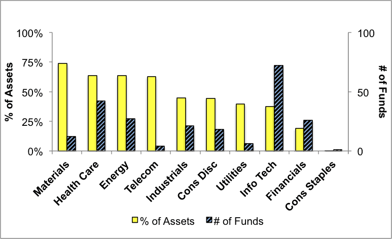
Figure 8 presents a mapping of Neutral funds by sector. The chart shows the number of Neutral funds in each sector and the percentage of assets allocated to Neutral-rated funds in each sector.
Figure 8: Neutral ETFs & Mutual Funds by Sector
Source: New Constructs, LLC and company filings
Figure 9 presents the data charted in Figure 8.
Figure 9: Neutral ETFs & Mutual Funds by Sector 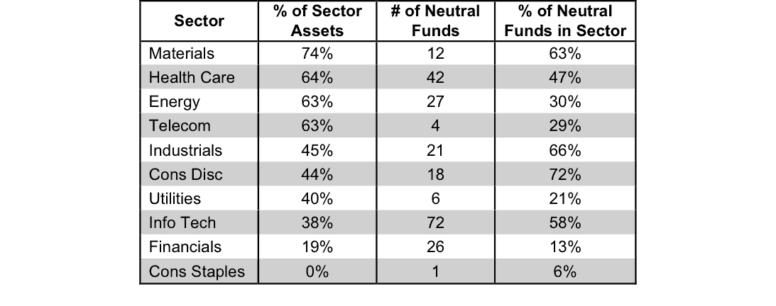
Source: New Constructs, LLC and company filings
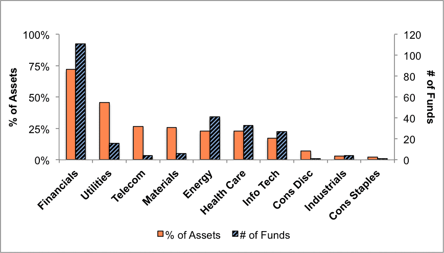
Figure 10 presents a mapping of Dangerous funds by fund sector. The chart shows the number of Dangerous funds in each sector and the percentage of assets allocated to Dangerous-rated funds in each sector.
The landscape of sector ETFs and mutual funds is littered with Dangerous funds. Investors in Financials have put over 72% of their assets in Dangerous-rated funds.
Figure 10: Dangerous ETFs & Mutual Funds by Sector
Source: New Constructs, LLC and company filings
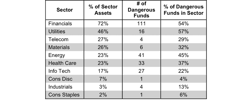
Figure 11 presents the data charted in Figure 10.
Figure 11: Dangerous ETFs & Mutual Funds by Sector
Source: New Constructs, LLC and company filings
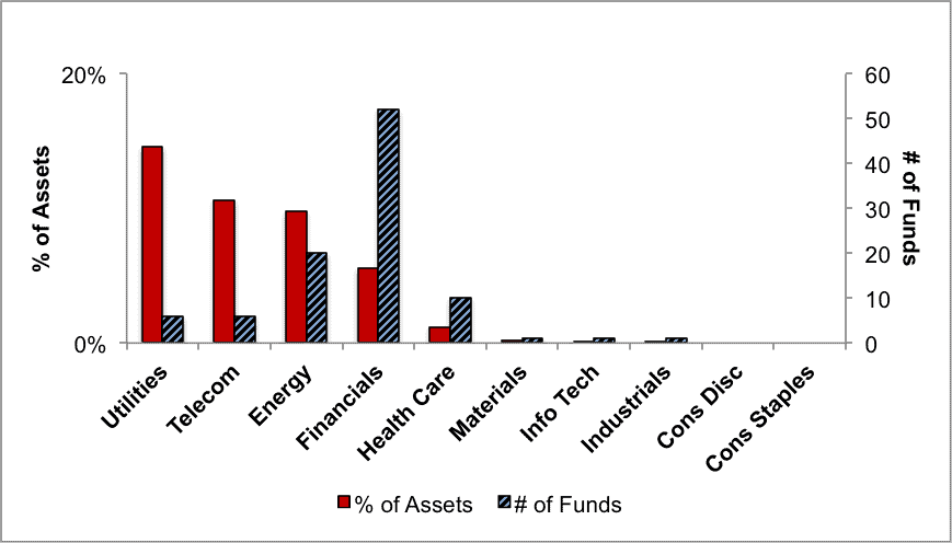
Figure 12 presents a mapping of Very Dangerous funds by fund sector. The chart shows the number of Very Dangerous funds in each sector and the percentage of assets in each sector allocated to funds that are rated Very Dangerous.
Taking into account the number of Dangerous funds from above, as well as the number of Very Dangerous funds shown below, the Financials sector has over 160 Dangerous-or-worse rated funds. Buyer beware.
Figure 12: Very Dangerous ETFs & Mutual Funds by Sector
Source: New Constructs, LLC and company filings
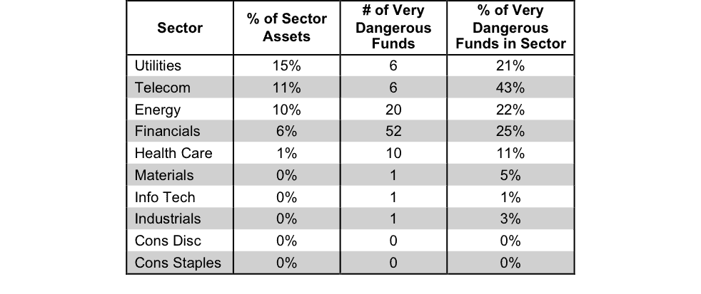
Figure 13 presents the data charted in Figure 12.
Figure 13: Very Dangerous ETFs & Mutual Funds by Sector
 Source: New Constructs, LLC and company filings André Rouillard contributed to this report.
Disclosure: David Trainer is long WMT. David Trainer, André Rouillard and Allen L. Jackson receive no compensation to write about any specific stock, sector or theme.