
The S&P 500’s free cash flow (FCF) remains high, but it is declining. The trailing FCF yield remains high as well, relative to recent quarters, because stock prices are declining more than FCF. We think the market is signaling expectations for further declines in FCF, and we expect prices will continue to fall until FCF bottoms out.
This report is an abridged and free version of S&P 500 & Sectors: Free Cash Flow Is Up But Prices Are Down, one of our quarterly series on fundamental market and sector trends.
The full version of this report analyzes[1],[2] free cash flow, enterprise value, and the trailing FCF yield for the S&P 500 and each of its sectors (last quarter’s analysis is here). These reports are available to those with a Pro or higher membership or can be purchased below.
This report leverages our cutting-edge Robo-Analyst technology to deliver proven-superior[3] fundamental research and support more cost-effective fulfillment of the fiduciary duty of care.
FCF Yield Rises Over the Last Year
2021 was a very profitable year for the S&P 500. The trailing FCF yield for the S&P 500 rose from 1.6% on 6/30/21 to 2.2% as of 5/16/22. The FCF yield for the S&P 500 has been this high only three other times since the beginning of 2015: 6/30/16, 12/31/18, and 3/31/22.
See Figure 1 in the full version of our report for the chart of FCF Yield for the S&P 500 from December 2004 thru 5/16/22.
Seven S&P 500 sectors saw an increase in trailing FCF yield from 6/30/21 to 5/16/22.
Key Details on Select S&P 500 Sectors
The Energy Sector has the highest FCF Yield at 5.0% as of 5/16/22. On the flip side, the Real Estate sector, at -4.4%, currently has the lowest trailing FCF yield of all S&P 500 sectors.
The Telecom Services, Energy, Utilities, Financials, Healthcare, Consumer Non-cyclicals, and Consumer Cyclicals sectors each saw an increase in trailing FCF yield from 6/30/21 to 5/16/22.
Below, we highlight the Telecom Services sector, which had the largest YoY improvement in FCF yield.
Sample Sector Analysis[4]: Telecom Services
Figure 1 shows the trailing FCF yield for the Telecom Services sector rose from -5.3% as of 6/30/21 to 2.6% as of 5/16/22. The Telecom Services sector FCF rose from -$86.9 billion in 1Q21 to $37.3 billion in 1Q22, while enterprise value fell from $1.6 trillion as of 6/30/21 to $1.4 trillion as of 5/16/22.
Figure 1: Telecom Services Trailing FCF Yield: Dec 2004 – 5/16/22
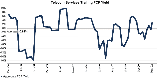
Sources: New Constructs, LLC and company filings.
The May 16, 2022 measurement period uses price data as of that date and incorporates the financial data from 1Q22 10-Qs, as this is the earliest date for which all the 1Q22 10-Qs for the S&P 500 constituents were available.
Figure 2 compares the trends in FCF and enterprise value for the Telecom Services sector since 2004. We sum the individual S&P 500/sector constituent values for free cash flow and enterprise value. We call this approach the “Aggregate” methodology, and it matches S&P Global’s (SPGI) methodology for these calculations.
Figure 2: Telecom Services FCF & Enterprise Value: Dec 2004 – 5/16/22
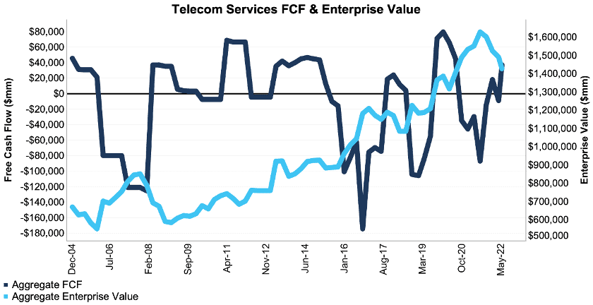
Sources: New Constructs, LLC and company filings.
The May 16, 2022 measurement period uses price data as of that date and incorporates the financial data from 1Q22 10-Qs, as this is the earliest date for which all the 1Q22 10-Qs for the S&P 500 constituents were available.
The Aggregate methodology provides a straightforward look at the entire S&P 500/sector, regardless of market cap or index weighting, and matches how S&P Global (SPGI) calculates metrics for the S&P 500.
For additional perspective, we compare the Aggregate method for free cash flow with two other market-weighted methodologies: market-weighted metrics and market-weighted drivers. Each method has its pros and cons, which are detailed in the Appendix.
Figure 3 compares these three methods for calculating the Telecom Services sector’s trailing FCF yields.
Figure 3: Telecom Services Trailing FCF Yield Methodologies Compared: Dec 2004 – 5/16/22
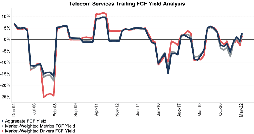
Sources: New Constructs, LLC and company filings.
The May 16, 2022 measurement period uses price data as of that date and incorporates the financial data from 1Q22 10-Qs, as this is the earliest date for which all the 1Q22 10-Qs for the S&P 500 constituents were available.
This article originally published on May 26, 2022.
Disclosure: David Trainer, Kyle Guske II, and Matt Shuler receive no compensation to write about any specific stock, style, or theme.
Follow us on Twitter, Facebook, LinkedIn, and StockTwits for real-time alerts on all our research.
Appendix: Analyzing Trailing FCF Yield with Different Weighting Methodologies
We derive the metrics above by summing the individual S&P 500/sector constituent values for free cash flow and enterprise value to calculate trailing FCF yield. We call this approach the “Aggregate” methodology.
The Aggregate methodology provides a straightforward look at the entire S&P 500/sector, regardless of market cap or index weighting, and matches how S&P Global (SPGI) calculates metrics for the S&P 500.
For additional perspective, we compare the Aggregate method for free cash flow with two other market-weighted methodologies. These market-weighted methodologies add more value for ratios that do not include market values, e.g. ROIC and its drivers, but we include them here, nonetheless, for comparison:
- Market-weighted metrics – calculated by market-cap-weighting the trailing FCF yield for the individual companies relative to their sector or the overall S&P 500 in each period. Details:
- Company weight equals the company’s market cap divided by the market cap of the S&P 500/ its sector
- We multiply each company’s trailing FCF yield by its weight
- S&P 500/Sector trailing FCF yield equals the sum of the weighted trailing FCF yields for all the companies in the S&P 500/sector
- Market-weighted drivers – calculated by market-cap-weighting the FCF and enterprise value for the individual companies in each sector in each period. Details:
- Company weight equals the company’s market cap divided by the market cap of the S&P 500/ its sector
- We multiply each company’s free cash flow and enterprise value by its weight
- We sum the weighted FCF and weighted enterprise value for each company in the S&P 500/each sector to determine each sector’s weighted FCF and weighted enterprise value
- S&P 500/Sector trailing FCF yield equals weighted S&P 500/sector FCF divided by weighted S&P 500/sector enterprise value
Each methodology has its pros and cons, as outlined below:
Aggregate method
Pros:
- A straightforward look at the entire S&P 500/sector, regardless of company size or weighting.
- Matches how S&P Global calculates metrics for the S&P 500.
Cons:
- Vulnerable to impact of companies entering/exiting the group of companies, which could unduly affect aggregate values. Also susceptible to outliers in any one period.
Market-weighted metrics method
Pros:
- Accounts for a firm’s market cap relative to the S&P 500/sector and weights its metrics accordingly.
Cons:
- Vulnerable to outlier results disproportionately impacting the overall trailing FCF yield.
Market-weighted drivers method
Pros:
- Accounts for a firm’s market cap relative to the S&P 500/sector and weights its free cash flow and enterprise value accordingly.
- Mitigates the disproportionate impact of outlier results from one company on the overall results.
Cons:
- More volatile as it adds emphasis to large changes in FCF and enterprise value for heavily weighted companies.
[1] We calculate these metrics based on S&P Global’s (SPGI) methodology, which sums the individual S&P 500 constituent values for market cap and economic book value before using them to calculate the metrics. We call this the “Aggregate” methodology.
[2] Our research is based on the latest audited financial data, which is the 1Q22 10-Q for most companies. Price data is as of 5/16/22.
[3] Our research utilizes our Core Earnings, a more reliable measure of profits, as proven in Core Earnings: New Data & Evidence, written by professors at Harvard Business School (HBS) & MIT Sloan and published in The Journal of Financial Economics.
[4] The full version of this report provides analysis for every sector like what we show for this sector.