At the beginning of the second quarter of 2016, no sectors earn an Attractive-or-better rating. Our sector ratings are based on the aggregation of our fund ratings for every ETF and mutual fund in each sector. See last quarter’s Sector Ratings here.
Investors looking for sector funds that hold quality stocks should focus on the Consumer Staples and Information Technology sectors. These sectors, despite not earning an Attractive rating overall, contain the highest percentage of assets allocated to Attractive-or-better rated funds. Figures 4 through 7 provide more details. The primary driver behind an Attractive fund rating is good portfolio management, or good stock picking, with low total annual costs.
Attractive-or-better ratings do not always correlate with Attractive-or-better total annual costs. This fact underscores that (1) cheap funds can dupe investors and (2) investors should invest only in funds with good stocks and low fees.
See Figures 4 through 13 for a detailed breakdown of ratings distributions by sector. See our ETF & mutual fund screener for rankings, ratings and reports on 7000+ mutual funds and 400+ ETFs. Our fund rating methodology is detailed here.
All of our reports on the best & worst ETFs and mutual funds in every sector are available here.
Figure 1: Ratings For All Sectors
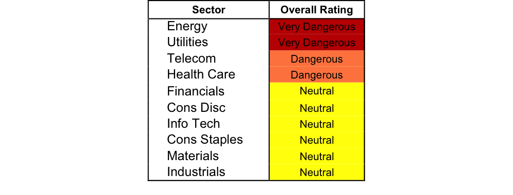
Source: New Constructs, LLC and company filings
To earn an Attractive-or-better Predictive Rating, an ETF or mutual fund must have high-quality holdings and low costs. Only the top 30% of all ETFs and mutual funds earn our Attractive or better ratings.
U.S. Global Jets ETF (JETS) is the top rated Industrials fund. It gets our Very Attractive rating by allocating over 66% of its value to Attractive-or-better-rated stocks.
Southwest Airlines (LUV: $44/share) is one of our favorite stocks held by JETS and earns a Very Attractive rating. LUV was recently featured as a new stock on March’s Most Attractive stocks list and remains on April’s Most Attractive Stocks list. Over the past decade, Southwest Airlines has grown after-tax profit (NOPAT) by 17% compounded annually. During this time period, the company’s return on invested capital (ROIC) improved from 6% in 2005 to a top quintile 17% over the last twelve months. However, LUV is only up 6% over the past year, and shares have become undervalued. At its current price of $44/share, LUV has a price to economic book value (PEBV) ratio of 0.9. This ratio means that the market expects Southwest’s NOPAT to permanently decline by 10%. If Southwest can grow NOPAT by just 5% compounded annually for the next decade, the stock is worth $65/share today – a 48% upside.
Saratoga Advantage Energy & Basic Materials Portfolio (SBMBX) is the worst Energy fund. It gets our Very Dangerous rating by allocating over 55% of its value to Dangerous-or-worse-rated stocks. Making matters worse, its total annual costs are a whopping 6.26%.
ConocoPhillips (COP: $39/share) is one of our least favorite stocks held by SBMBX and earns a Dangerous rating. ConocoPhillips’ business has been deteriorating for quite some time. Over the past decade, the company’s NOPAT has declined from $15.8 billion to -$586 million. Over the same time frame, its ROIC fell from 18% in 2005 to a bottom quintile 0% in 2015. Unfortunately for investors, the price decline over the past two years has not been enough and COP remains overvalued. To justify its current price of $39/share, COP must grow revenue by 20% compounded annually for the next 16 years. Keep in mind that COP’s revenues have declined each of the last four years and it’s easy to see just how optimistic the expectations baked into COP remain.
Figure 2 shows the distribution of our Predictive Ratings for all sector ETFs and mutual funds.
Figure 2: Distribution of ETFs & Mutual Funds (Assets and Count) by Predictive Rating
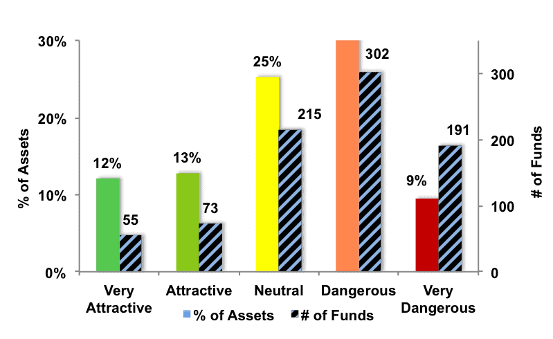
Source: New Constructs, LLC and company filings
Figure 3 offers additional details on the quality of the sector funds. Note that the average total annual cost of Very Dangerous funds is over seven times that of Very Attractive funds.
Figure 3: Predictive Rating Distribution Stats
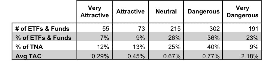
* Avg TAC = Weighted Average Total Annual Costs
Source: New Constructs, LLC and company filings
This table shows that only the best of the best funds get our Very Attractive Rating: they must hold good stocks AND have low costs. Investors deserve to have the best of both and we are here to give it to them.
Ratings by Sector
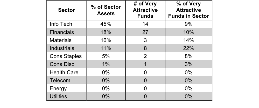
Figure 4 presents a mapping of Very Attractive funds by sector. The chart shows the number of Very Attractive funds in each sector and the percentage of assets in each sector allocated to funds that are rated Very Attractive.
Figure 4: Very Attractive ETFs & Mutual Funds by Sector
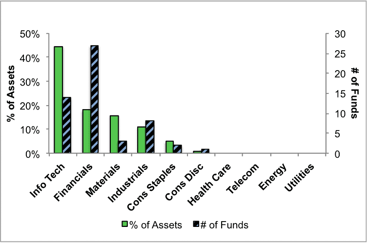
Source: New Constructs, LLC and company filings
Figure 5 presents the data charted in Figure 4.
Figure 5: Very Attractive ETFs & Mutual Funds by Sector
Source: New Constructs, LLC and company filings
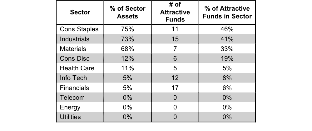
Figure 6 presents a mapping of Attractive funds by sector. The chart shows the number of Attractive funds in each sector and the percentage of assets allocated to Attractive-rated funds in each sector.
Figure 6: Attractive ETFs & Mutual Funds by Sector
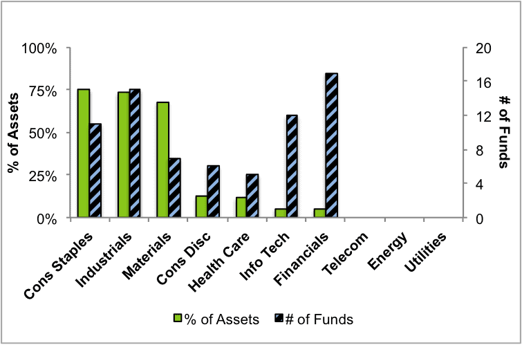
Source: New Constructs, LLC and company filings
Figure 7 presents the data charted in Figure 6.
Figure 7: Attractive ETFs & Mutual Funds by Sector
Source: New Constructs, LLC and company filings
Figure 8 presents a mapping of Neutral funds by sector. The chart shows the number of Neutral funds in each sector and the percentage of assets allocated to Neutral-rated funds in each sector.
Figure 8: Neutral ETFs & Mutual Funds by Sector
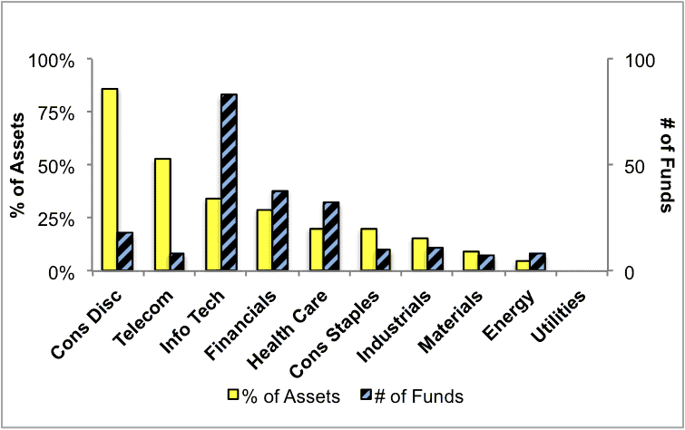
Source: New Constructs, LLC and company filings
Figure 9 presents the data charted in Figure 8.
Figure 9: Neutral ETFs & Mutual Funds by Sector
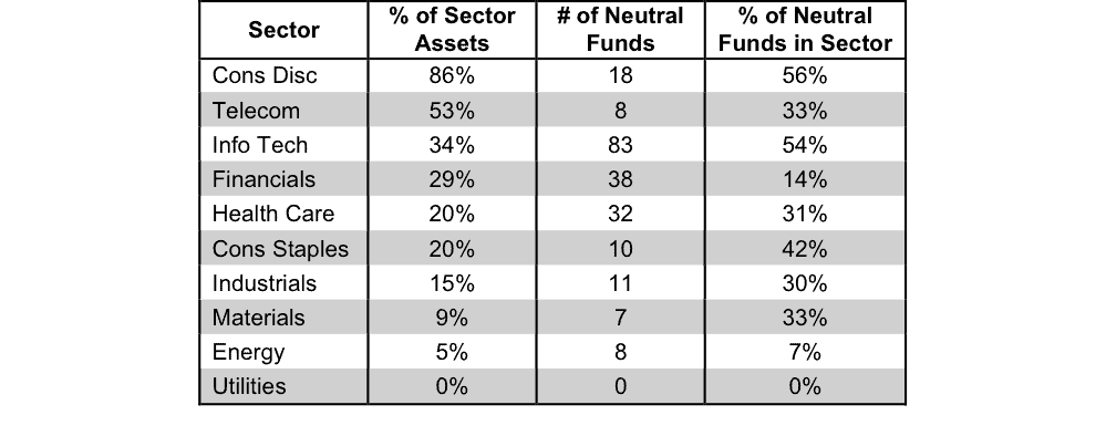
Source: New Constructs, LLC and company filings
Figure 10 presents a mapping of Dangerous funds by fund sector. The chart shows the number of Dangerous funds in each sector and the percentage of assets allocated to Dangerous-rated funds in each sector.
The landscape of sector ETFs and mutual funds is littered with Dangerous funds. Investors in Utilities funds have put over 65% of their assets in Dangerous-rated funds.
Figure 10: Dangerous ETFs & Mutual Funds by Sector
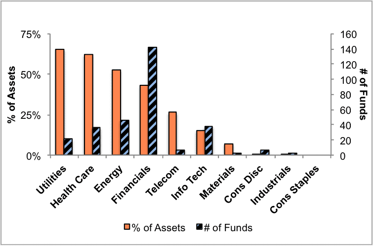
Source: New Constructs, LLC and company filings
Figure 11 presents the data charted in Figure 10.
Figure 11: Dangerous ETFs & Mutual Funds by Sector
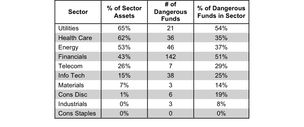
Source: New Constructs, LLC and company filings
Figure 12 presents a mapping of Very Dangerous funds by fund sector. The chart shows the number of Very Dangerous funds in each sector and the percentage of assets in each sector allocated to funds that are rated Very Dangerous.
Figure 12: Very Dangerous ETFs & Mutual Funds by Sector
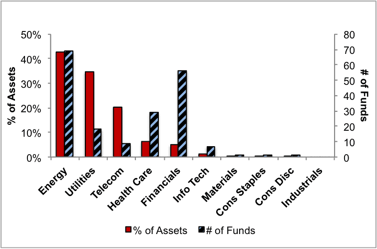
Source: New Constructs, LLC and company filings
Figure 13 presents the data charted in Figure 12.
Figure 13: Very Dangerous ETFs & Mutual Funds by Sector
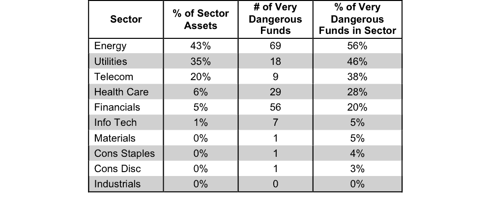
Source: New Constructs, LLC and company filings
Disclosure: David Trainer and Kyle Guske II receive no compensation to write about any specific stock, sector or theme.