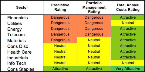
At the outset of the 3Q2013, only the Consumer Staples sector earns an Attractive rating. My sector ratings are based on the aggregation of my fund ratings for every ETF and mutual fund in each sector.
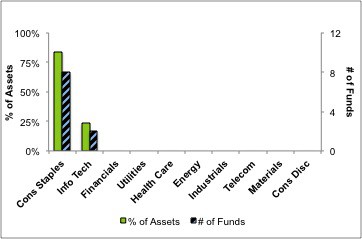
Investors looking for sector funds that hold quality stocks should look no further than the Consumer Staples and Information Technology sectors. Only these sectors house Attractive-or-better rated funds. Figures 6 and 7 provide details. The primary driver behind an Attractive fund rating is good portfolio management, or good stock picking, with low total annual costs.
Note that the Attractive-or-better Predictive ratings do not always correlate with Attractive-or-better total annual costs. This fact underscores that (1) low fees can dupe investors and (2) investors should invest only in funds with good stocks and low fees.
See Figures 4 through 13 for a detailed breakdown of ratings distributions by sector. See my free ETF & mutual fund screener for rankings, ratings and free reports on 7000+ mutual funds and 400+ ETFs. My fund rating methodology is detailed here.
All of my reports on the best & worst ETFs and mutual funds in every sector are available here.
Figure 1: Ratings For All Sectors
To earn an Attractive-or-better Predictive Rating, an ETF or mutual fund must have high-quality holdings and low costs. Only 10 sector ETFs and mutual funds meet these requirements, which is only 1% of all sector ETFs and mutual funds.
Consumer Staples Select Sector SPDR (XLP) is my top Consumer Staples ETF. It gets my Attractive rating by allocating over 61% of its value to Attractive-or-better-rated stocks.
The Procter & Gamble Company (PG) is one of my favorite stocks held by XLP and earns my Attractive rating. GAAP data significantly understates the profitability of PG. In 2012, PG’s reported earnings were artificially depressed by over $1.2 billion of non-operating expenses hidden in operating items. PG is currently undergoing a restructuring plan that involves significant cutting of personnel and technological upgrades, and this plan has non-recurring charges of over $1 billion related to it.
Investors just looking at reported earnings would see a compounded annual decline of 7% over the past three years. In reality, PG has actually grown its after tax operating profit (NOPAT) by just over 1% a year during that time. The misleading decline in PG’s profits are part of the reason the stock is undervalued. At its current valuation of ~$78.34/share, PG has a price to economic book value ratio of only 1.1, implying that the company will never grow NOPAT more than 10% from its current level. Not many blue chip stocks trade at such a cheap price.
Rydex Series Funds: Real Estate Fund (RYREX) is my worst Financials mutual fund. It gets my Very Dangerous rating by allocating over 76% of its value to Neutral-or-worse-rated stocks, and to make matters worse, charges investors annual costs of over 7%.
Ventas Inc. (VTR) is one of my least favorite stocks held by RYREX. I wrote in a recent Danger Zone article that many REITs are dangerously overvalued, and VTR is a perfect example. People expect the growth in demand for senior housing to provide a massive boost to VTR’s profits, but they ignore the fact that more companies are entering the market, pushing down margins. VTR’s NOPAT margin has declined from over 70% in 2003 to 14% last year. At those margins, VTR would need to grow revenue by 20% a year for 15 years to justify its valuation of ~$68.04/share. Such high expectations and declining profit margin earn VTR my Very Dangerous Rating.
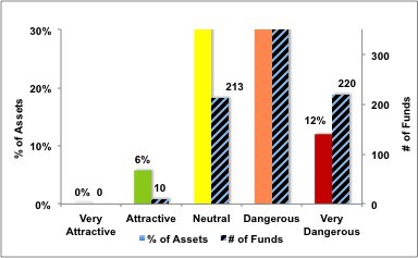
Figure 2 shows the distribution of our Predictive Ratings for all sector ETFs and mutual funds.
Figure 2: Distribution of ETFs & Mutual Funds (Assets and Count) by Predictive Rating
Figure 3 offers additional details on the quality of the sector funds. Note that the average Total Annual Cost of Very Dangerous funds is almost 10 times that of Attractive funds.
Figure 3: Predictive Rating Distribution Stats

Source: New Constructs, LLC and company filings
This table shows that only the best of the best funds get our Very Attractive Rating: they must hold good stocks AND have low costs. Investors deserve to have the best of both and we are here to give it to them.
Ratings by Sector
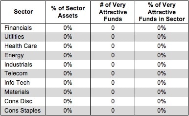
Figure 4 presents a mapping of Very Attractive funds by sector. The chart shows that no funds in any sector earn a Very Attractive rating. Fund managers and ETF providers really should be doing better.
Figure 4: Very Attractive ETFs & Mutual Funds by Sector
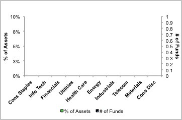
Figure 5 presents the data charted in Figure 4
Figure 5: Very Attractive ETFs & Mutual Funds by Sector
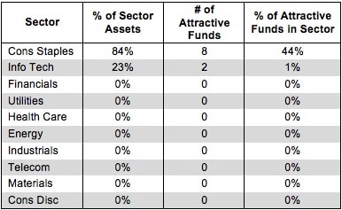
Figure 6 presents a mapping of Attractive funds by sector. The chart shows the number of Attractive funds in each sector and the percentage of assets allocated to Attractive-rated funds in each sector.
Encouragingly, the percentage of assets in Attractive Consumer Staples and Information Technology funds is higher than the percentage of Attractive funds in each sector. Investors appear to be successfully finding the best funds in these sectors.
Figure 6: Attractive ETFs & Mutual Funds by Sector
Figure 7 presents the data charted in Figure 6.
Figure 7: Attractive ETFs & Mutual Funds by Sector
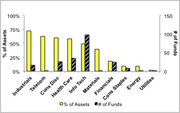
Figure 8 presents a mapping of Neutral funds by sector. The chart shows the number of Neutral funds in each sector and the percentage of assets allocated to Neutral-rated funds in each sector.
Figure 8: Neutral ETFs & Mutual Funds by Sector
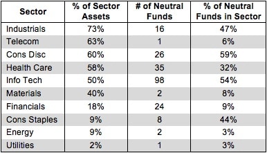
Figure 9 presents the data charted in Figure 8.
Figure 9: Neutral ETFs & Mutual Funds by Sector
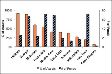
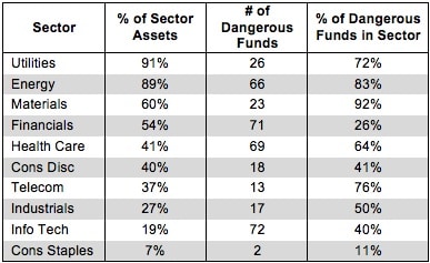
Figure 10 presents a mapping of Dangerous funds by fund sector. The chart shows the number of Dangerous funds in each sector and the percentage of assets allocated to Dangerous-rated funds in each sector.
Even quality sectors can have landmines to avoid. The second-ranked Information Technology sector still has 72 Dangerous ETFs and mutual funds lurking to punish careless investors.
Figure 10: Dangerous ETFs & Mutual Funds by Sector
Figure 11 presents the data charted in Figure 10.
Figure 11: Dangerous ETFs & Mutual Funds by Sector
 Source: New Constructs, LLC and company filings
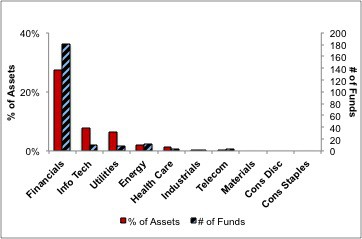
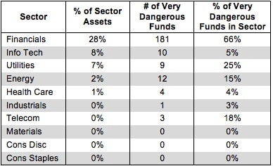
Figure 12 presents a mapping of Very Dangerous funds by fund sector. The chart shows the number of Very Dangerous funds in each sector and the percentage of assets in each sector allocated to funds that are rated Very Dangerous.
181 ETFs and mutual funds in the Financials sector earn my Very Dangerous rating. No sector even needs 181 funds in total, much less 181 funds with poor holdings and high fees.
Figure 12: Very Dangerous ETFs & Mutual Funds by Sector
Figure 13 presents the data charted in Figure 12.
Figure 13: Very Dangerous ETFs & Mutual Funds by Sector
Sam McBride contributed to this report.
Disclosure: David Trainer and Sam McBride receive no compensation to write about any specific stock, sector, or theme.
