
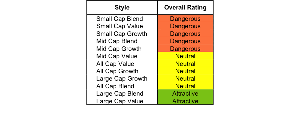
At the beginning of the second quarter of 2015, only the Large Cap Value and Large Cap Blend styles earn our Attractive rating. Our style ratings are based on the aggregation of our fund ratings for every ETF and mutual fund in each style.
Investors looking for style funds that hold quality stocks should look no further than the Large Cap Value and Large Cap Blend styles. These styles house the most Attractive-or-better rated funds. Figures 6 and 7 provide details. The primary driver behind an Attractive fund rating is good portfolio management, or good stock picking, with low total annual costs.
Note that the Attractive-or-better overall ratings do not always correlate with Attractive-or-better total annual costs. This fact underscores that (1) cheap funds can dupe investors and (2) investors should invest only in funds with good stocks and low fees.
See Figures 4 through 13 for a detailed breakdown of ratings distributions by investment style.
Figure 1: Ratings For All Investment Styles
To earn an Attractive-or-better Predictive Rating, an ETF or mutual fund must have high-quality holdings and low costs. 2151 style ETFs and mutual funds meet these requirements, which is 30% of all style ETFs and mutual funds.
Catalyst Lyons Tactical Allocation Fund (CLTIX) is our top All Cap Blend Mutual Fund. It gets our Very Attractive rating by allocating over 53% of its value to Attractive-or-better-rated stocks.
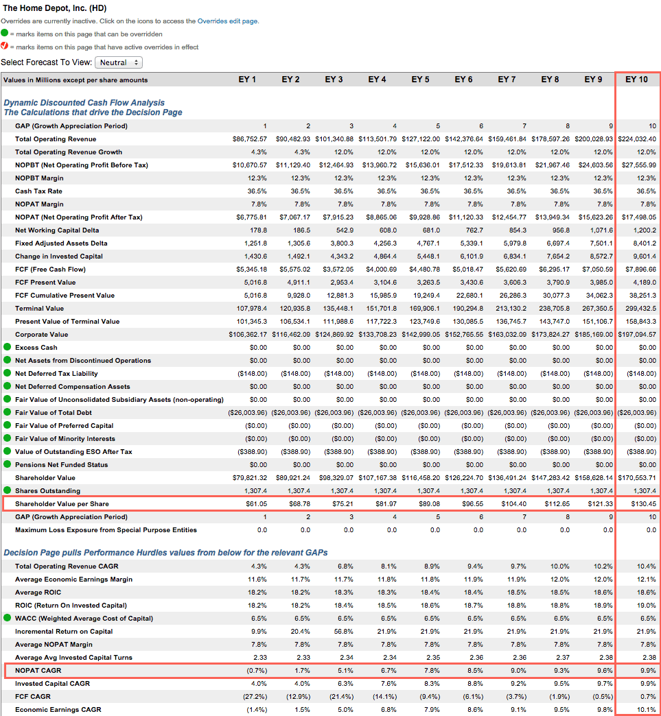
Home Depot (HD) is one of our favorite stocks held by CLTIX. Home Depot has achieved outstanding financial results since the housing market meltdown of 2008. Since 2009, net operating profit after tax (NOPAT) has grown by 11% compounded annually. Return on invested capital (ROIC) over this period has averaged 15% and has grown every year since 2010 to a top quintile 19% in 2015. Free cash flow performance has been just as admirable. Since 2008, the company has generated a cumulative $40 billion in free cash flow, and the company generated over $7 billion in free cash flow in 2015 alone. Due to Home Depot having a consistent and reliable track record of creating shareholder value and wealth, the stock is priced with a deserved premium. However, paying more for quality businesses is preferred over paying less for poor companies. That being said, there is still upside to be had in Home Depot. If Home Depot can grow NOPAT by 10% compounded annually for the next 10 years the stock is worth $130/share today – a 15% upside.
Chartwell Small Cap Fund (CWSVX) is our worst Small Cap Blend Mutual Fund. It gets our Very Dangerous rating by allocating over 65% of its value to Dangerous-or-worse-rated stocks. Making matters worse, it also charges investors total annual costs of 5.22%.
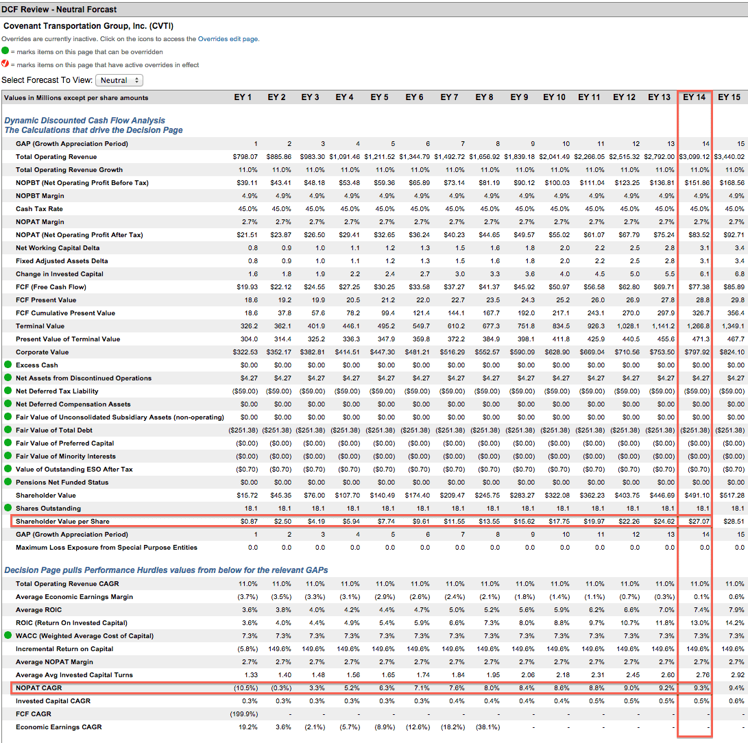
Covenant Transportation Group (CVTI) is one of our least favorite stocks held by small cap funds. Since 2004, Covenant has generated very low returns on capital — in fact, over the last decade, Covenant’s ROIC has never exceeded 5%. This fact places Covenant in the bottom quintile of over 3000 companies we cover. In addition the company has generated negative economic earnings every single year since 2004. Effectively, for the past 10 years the company has been destroying shareholder value, as the costs of its capital is higher than its returns. Meanwhile, CVTI’s stock price has more than tripled since 2013. However, the operating performance of the company does not reflect this rapid price appreciation. In order to justify its current price of $27/share, Covenant would need to grow NOPAT at 9% compounded annually for the next 14 years. This appears very optimistic given that the company has grown NOPAT by less than 1% compounded annually since 1998. In this case, the valuation of the stock leaves ample downside risk and very little upside due to ongoing shareholder value destruction.
Figure 2 shows the distribution of our Predictive Ratings for all investment style ETFs and mutual funds.
Figure 2: Distribution of ETFs & Mutual Funds (Assets and Count) by Predictive Rating
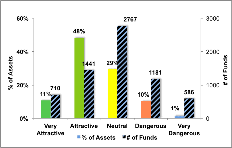
Figure 3 offers additional details on the quality of the investment style funds. Note that the average total annual costs of Very Dangerous funds is over four times that of Very Attractive funds.
Figure 3: Predictive Rating Distribution Stats
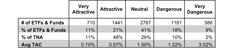
* Avg TAC = Weighted Average Total Annual Costs
This table shows that only the best of the best funds get our Very Attractive Rating: they must hold good stocks AND have low costs. Investors deserve to have the best of both and we are here to give it to them.
Ratings by Investment Style
Figure 4 presents a mapping of Very Attractive funds by investment style. The chart shows the number of Very Attractive funds in each investment style and the percentage of assets in each style allocated to funds that are rated Very Attractive.
710 investment style funds earn our Very Attractive rating.
Figure 4: Very Attractive ETFs & Mutual Funds by Investment Style
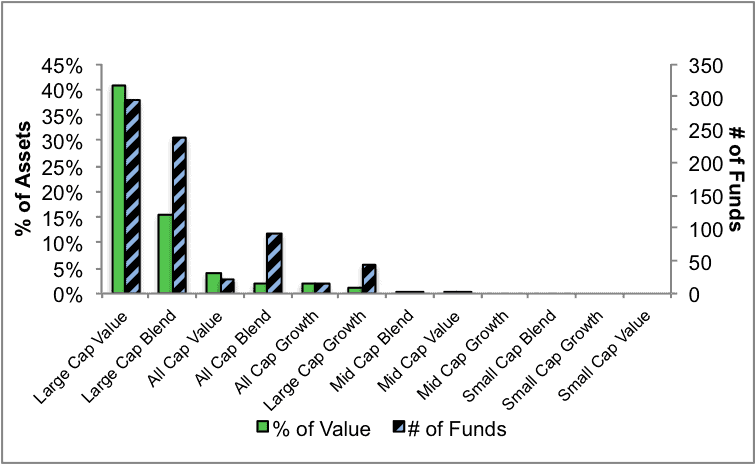
Figure 5 presents the data charted in Figure 4
Figure 5: Very Attractive ETFs & Mutual Funds by Investment Style
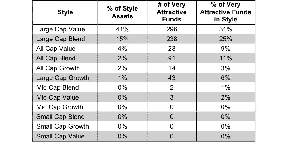
Figure 6 presents a mapping of Attractive funds by investment style. The chart shows the number of Attractive funds in each style and the percentage of assets allocated to Attractive-rated funds in each style.
Note that the Large Cap Blend and the Large Cap Value funds have the highest number of Attractive Funds.
Figure 6: Attractive ETFs & Mutual Funds by Investment Style
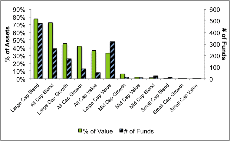
Figure 7 presents the data charted in Figure 6.
Figure 7: Attractive ETFs & Mutual Funds by Investment Style
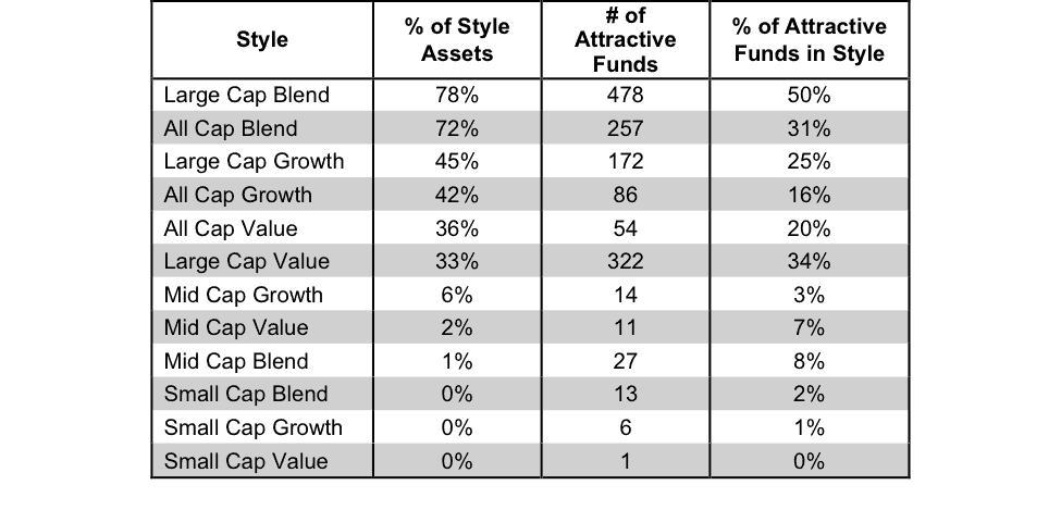
Figure 8 presents a mapping of Neutral funds by investment style. The chart shows the number of Neutral funds in each investment style and the percentage of assets allocated to Neutral-rated funds in each style.
Figure 8: Neutral ETFs & Mutual Funds by Investment Style
Figure 9 presents the data charted in Figure 8.
Figure 9: Neutral ETFs & Mutual Funds by Investment Style
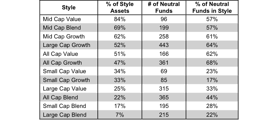
Figure 10 presents a mapping of Dangerous funds by fund style. The chart shows the number of Dangerous funds in each investment style and the percentage of assets allocated to Dangerous-rated funds in each style.
Figure 10: Dangerous ETFs & Mutual Funds by Investment Style
Figure 11 presents the data charted in Figure 10.
Figure 11: Dangerous ETFs & Mutual Funds by Investment Style
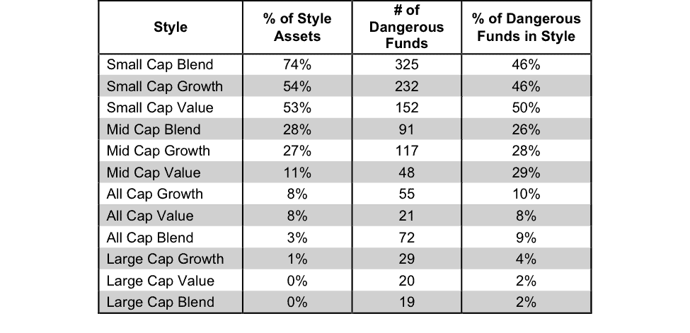
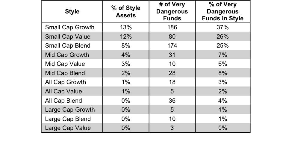
Figure 12 presents a mapping of Very Dangerous funds by fund style. The chart shows the number of Very Dangerous funds in each investment style and the percentage of assets in each style allocated to funds that are rated Very Dangerous.
Figure 12: Very Dangerous ETFs & Mutual Funds by Investment Style
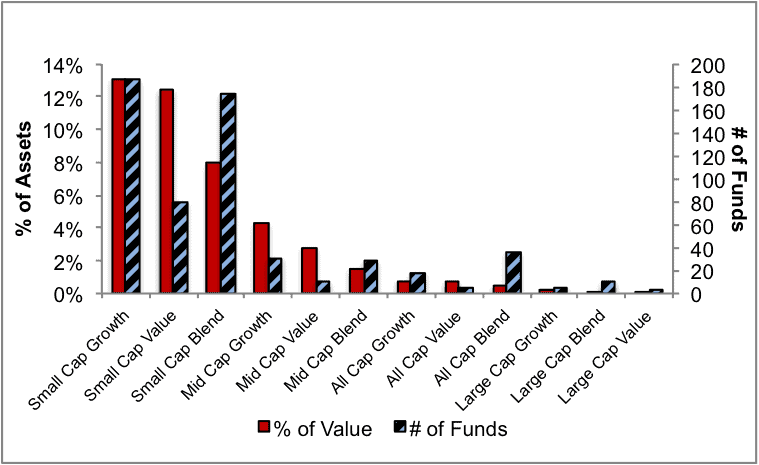
Figure 13 presents the data charted in Figure 12.
Figure 13: Very Dangerous ETFs & Mutual Funds by Investment Style
Source Figure 1-13: New Constructs, LLC and company filings
Disclosure: David Trainer and Allen L. Jackson receive no compensation to write about any specific stock, sector or theme.