
There’s a bubble in people saying “there’s a bubble”. Everyday another headline asks “When Will the Tech Bubble Burst?” With the S&P 500 up over 300% since its 2009 low and the NASDAQ up over 450%, many analysts claim that valuations are unsustainably high.
What those analysts won’t tell you is that many of them have been saying we’re in a bubble since 2011. When you dig past the noise and look at the data, it’s clear that there’s no comparison between today and 1999. As we wrote in our article “Can the Market Grow Into its Valuation?”, valuations today are stretched, but not in bubble territory.
In addition, big names like Facebook (FB) getting punished on earnings shows that fundamentals still matter. If this were 1999, analysts would have found a way to spin yesterday’s report as a positive.
Below, we present five charts that clearly lay to rest the idea that we’re in another tech bubble.
Growth Expectations Are Significantly Lower Today
Investors that use traditional valuation metrics may think we’re getting close to tech bubble territory. The S&P 500’s current P/E ratio of 24 is not that far off from the market top in April 2000, when it stood at 29. However, P/E ratios are not a good measure of value because they’re based on flawed accounting earnings. In particular, market earnings in 2000 failed to take into account billions of dollars in stock-compensation expense.
Investors wanting a more accurate measure of valuation should look at the price-to-economic book value (PEBV) ratio, which compares a company’s current stock price to the zero-growth value of its cash flows, i.e. NOPAT. By this measure (see Figure 1), the market[1] today is only ~1/4 as expensive as it was at its 2000 peak.
Figure 1: Price to Economic Book Value Since 2000
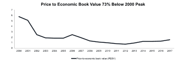
Sources: New Constructs, LLC and company filings.
While the market’s PEBV has more than doubled since 2012, from 0.7 to 1.5, it’s nowhere close to its tech bubble level of 5.7.
Margins Shouldn’t Regress to Tech Bubble Lows
The market is significantly cheaper today than in 2000 in part because companies have become much more profitable. U.S. companies earned an aggregate after-tax operating profit (NOPAT) margin of 10.4% in 2017, while in 2000, margins were just 7.7%.
The argument from bears is that today’s high margins are unsustainable, and we should expect a regression back to the levels of the tech bubble. However, Figure 2 shows that a regression, if it happens, should not be nearly as pronounced. Instead it seems more likely that margins would regress to their medium-term average of ~9.1%.
Figure 2: NOPAT Margins Since 2000
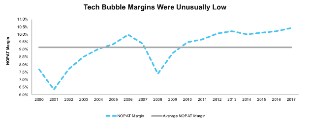
Sources: New Constructs, LLC and company filings.
Even this smaller regression seems unlikely due to the lowering of the corporate tax rate from 35% to 21%. The positive impact of tax cuts should offset any negative impact on profit margins from rising wages and commodity costs.
Same Goes for the Cost of Capital
The market’s cheaper valuation is also partially due to its lower weighted average cost of capital (WACC). Since economic profitability comes from the difference between return on invested capital (ROIC) and WACC, a lower WACC means higher economic profits. While interest rates are starting to rise, the market’s current WACC of 5.9% is significantly below its 9.6% at the height of the tech bubble.
As we wrote in “The Fed Is Irrelevant: Low Interest Rates Are the New Normal,” interest rates are unlikely to rebound to the level of the late 90’s. Instead, interest rate “normalization” should lead to WACC regressing towards the medium-term average of ~6.7%, as shown in Figure 3.
Figure 3: Weighted Average Cost of Capital Since 2000
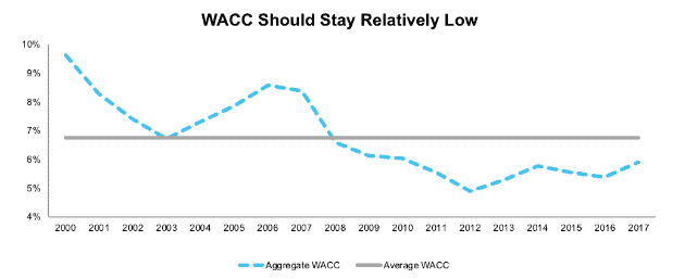
Sources: New Constructs, LLC and company filings.
Figures 2 and 3 show why bringing up price to sales, as some market bears do, doesn’t tell the whole story. It’s true that the market’s enterprise vale to revenue of 2.6 is the same as it was in 2000[2], but companies today convert significantly more of that revenue to profit and have a much lower cost of capital.
The Tech Sector Deserves to Lead the Charge
The tech-driven nature of the market also has many investors concerned. The S&P 500 is up 5% in 2018, but much of that gain has been driven by the tech sector’s 15% rise. On the other hand, 6 of the remaining 10 sectors have negative returns.
However, Figure 4 shows that the tech sector deserves to be leading the market due to its growth and profitability. Technology is the only sector that increased its economic earnings in 2017. It earned over $170 billion in economic profit in 2017 compared to $41 billion in economic losses in 2000.
Figure 4: Tech Sector Economic Earnings Since 2000
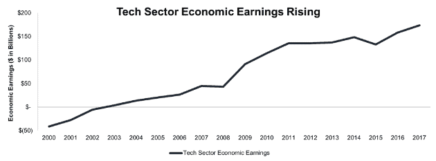
Sources: New Constructs, LLC and company filings.
Investors have also been concerned that market gains have been heavily concentrated in a handful of mega-cap companies, but historically, that’s not unusual. The nature of cap-weighted indexes means that the largest companies have an outsized impact. Despite the runup, the tech sector as a whole has a PEBV of 1.9, still nowhere near 2000 levels.
Cash Is King
Ultimately, the valuation of any company – and the market as a whole – comes down to the cash flow it generates. As the common saying goes, “earnings are an opinion, cash is a fact.”
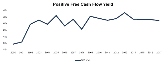
Figure 5 shows that the market has a positive free cash flow yield over the past eight years compared to a negative 6.3% free cash flow yield in 2000. Free cash flow is declining, but it’s nowhere near the losses of the tech bubble.
Figure 5: Free Cash Flow Yield Since 2000
Sources: New Constructs, LLC and company filings.
Not only does the market’s current free cash flow compare favorably to 2000, it also looks better than the negative cash flow in 2004 and 2006 leading up to the ’08 crash.
Smaller Bubbles May Pop
While the market as a whole is not in a bubble, there certainly are pockets of the market that have bubble-like valuations. Everyone knows the names at this point, companies like Amazon (AMZN), Netflix (NFLX), and Tesla (TSLA) are valued at massive premiums to their current profits (or in Tesla’s case, current losses).
Amazon in particular is reminiscent of the tech bubble in the way the company encourages investors to focus on “alternative” metrics. The company doesn’t generate enough operating profit to justify its valuation, so instead it emphasizes free cash flow per share. We warn investors to take that metric with a grain of salt.
Amazon’s free cash flow excludes important cash outflows. It doesn’t account for stock compensation expense, which in 2017 totaled $4.2 billion (50% of reported free cash flow). Employee stock compensation is a real expense that reduces the amount of cash flows available to existing shareholders, but Amazon ignores that cost.
Additionally, Amazon’s free cash flow calculation doesn’t account for the $13.2 billion (157% of free cash flow) in property acquired under capital leases in 2017 or the $9.7 billion (115% of free cash flow) in additional off-balance sheet operating leases.
While Amazon reported $8.4 billion in free cash flow in 2017, it’s actual free cash flow was -$39.1 billion. Even if we exclude the impact of the Whole Foods acquisition, Amazon’s free cash flow was negative ~$24 billion.
Amazon’s negative cash flow reflects the huge amount of capital poured into growing its business. The current valuation can’t be justified based on any traditional metrics. Amazon is closing in on a trillion-dollar valuation because investors believe in the idea of Amazon as “The Everything Store,” an entity that will dominate multiple markets, including most of retail.
Sometimes story stocks fulfill their narratives, but more often they do not. We’ve seen a number of story stocks with bubble-like valuations pop over the past few years, including Valeant (VRX) and Snapchat (SNAP). Many private “unicorns” are even seeing their bubbles burst before they hit the public markets, as we saw recently with the lackluster debut of Domo (DOMO).
The market is even punishing companies that produce real cash flows when they don’t live up to their valuations. Facebook grew operating income by 33% year over year in the last quarter, but it still fell short of market expectations, which sent the stock down nearly 20%.
The difference between now and the tech bubble is that these overvalued stocks are more about isolated narratives rather than broad market trends, and their inflated valuations haven’t led to the whole market being overvalued. Even with Facebook’s big drop, the NASDAQ is down by less than 1%.
Plenty of Value Remains
Part of the reason this market is not as expensive as the tech bubble is that many of the market leaders are relatively cheap. Alphabet (GOOGL) has been driving the market to new highs year after year, but it’s also generating huge amounts of cash flow.
In 2017, Alphabet generated $19.7 billion in free cash flow for a free cash flow yield of 3.1%. The company has grown economic earnings by 19% compounded annually over the past decade.
Unlike Amazon, Alphabet’s dominance manifests in profit as well as market share. While Amazon only accounted for 4% of U.S. retail sales in 2017, Google controls 75% of search traffic.
With a PEBV of 2.0, Alphabet is more expensive than the market today but significantly less pricey than the stocks during the tech bubble. Given its quality and growth, one can easily argue the company deserves a higher valuation. If Alphabet can grow economic earnings by 14% compounded annually over the next decade – down from the 19% annual growth rate over the past decade – the stock is worth $1,520/share today, a 26% upside from the current share price. See the math behind this dynamic DCF scenario.
Tech bubble doomsayers often lump Alphabet in with Amazon and Netflix, but they fail to recognize its superior profitability. In reality, Alphabet’s cash flows have faithfully underwritten the gains in its stock price over the past few years, and it earns a place in our Focus List – Long Model Portfolio.
Warnings of a new tech bubble paint the market with too broad of a brush. Instead of selling everything and waiting for the crash, investors should focus on performing fundamental diligence and separating the story stocks from the companies with the cash flows to support their stock prices.
This article originally published on July 16, 2018.
Disclosure: David Trainer, Sam McBride, and Kyle Guske II receive no compensation to write about any specific stock, sector, style, or theme.
Follow us on Twitter, Facebook, LinkedIn, and StockTwits for real-time alerts on all our research.
[1] Data covers the 1,000 largest U.S. stocks by market cap, equivalent to ~90% of the market cap of the Russell 3000
[2] See Appendix for details.
Click here to download a PDF of this report.
Photo Credit: Alexas_Fotos
4 replies to "5 Charts That Prove We’re Not in Another Tech Bubble"
This is an excellent overall analysis, but I would question one part of it. There seems to be a bifurcated market, even within tech companies. Some of these large tech companies, Apple, Cisco, Intel, have valuations that are predicated on pretty reasonable assumptions and very strong profitability. I wonder it you eliminate some of these companies if the remainder of the Nasdaq would look alot more pricey. So many small internet companies are trading at nosebleed valuations, but a company like Apple, which trades at much more moderate valuations, covers up alot of the over-valuation.
Thanks for reading and commenting. I tested your theory by taking the PEBV of the technology sector excluding Apple, Cisco, Intel, Oracle, SAP, IBM, and Micron, and adding in Amazon (which is classified as Consumer Cyclicals). Even with these changes, the PEBV of the tech sector only goes up to 2.9, which is definitely expensive, but still only about half of the PEBV of the entire market in 2000. See the numbers behind this analysis here
Sam, can you add in P/Economic Earnings in your analysis and articles. P/EE is another ratio with which one can analyse a company with her competitors.
Thanks for your comment. I did not use P/EE in this article because economic earnings were negative from 2000-2002, so it was hard to make a good comparison. However, if you want to see a chart of P/EE, it is available here